Imagine being a Peace Patrol Officer trying to log an urgent incident, but a slow, disorganized paper system hinders tracking. That was the challenge before our intervention.
Role
UX, UI, Interaction
Industry
Community Safety
Duration
3 months
Deliverables
User Flows, High Fidelity Wireframes, Prototype, Usability Testing, and Handoff
Tools
Trello, Figma, Notion, Maze, and Chat-GPT
Target Device
Mobile web app

Who is Philly Truce?
Philly Truce is a grassroots organization in Philadelphia working to reduce gun violence and promote peaceful conflict resolution.
Goal
The goal was to create a user-friendly mobile app for Peace Patrol Officers to log, track, and resolve incidents in real time.
Features:
Document new incidents
View existing reports
Claim unassigned incidents
Benefits:
Streamlined incident report management platform
Improve response times
Research
Before I joined, the team conducted usability testing and heatmap analysis to gather key insights. I used these findings to inform my design decisions and improve the overall user experience.
Usability Testing
Unveiling Insights Through Heatmaps
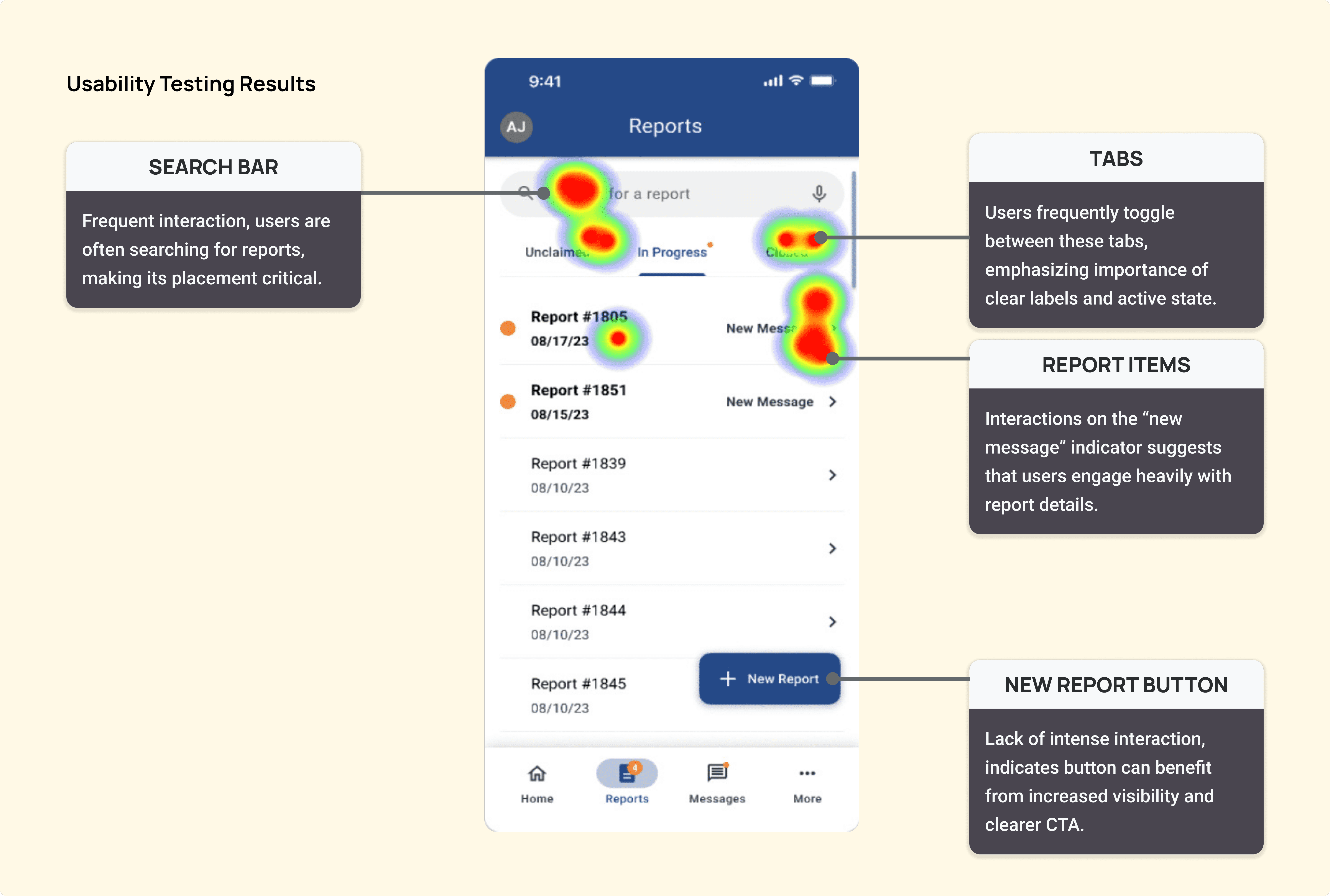
Research Insights
Who did we talk to?
Three current Peace Patrol Officers
One former Peace Patrol Officer
What features did we test?
Create a report
View in progress and closed reports
Claim a report from unclaimed tab
Edit a report
What were our findings?
New report button is affected by screen size
Users had trouble finding available and resolved reports
Users struggle to understand connection between reports available to work on vs unclaimed reports
Research Challenges
Platform Issues: Maze made task flow setup challenging by not allowing the last screen of one task to link to the next, complicating task sequences. It also restricts user control after task completion, unlike other platforms such as UserZoom.
Tight schedule, Limited Preparation Time: Imposed time constraints necessitated accelerated usability testing, involving rapid task development and testing with a sample of five participants (incl. one pilot test) within a one-week timeframe.
With extended timelines, we would have:
Enhanced task instructions for greater clarity and comprehensiveness.
Conducted more rigorous flow audits in Maze to identify and rectify technical issues, ensuring a more controlled testing environment. E.g., One participant was unable to find the test link so we had to share our screens with him, potentially introducing bias in his test flow and performance.
Unsatisfactory Testing Environment: Some participants were consistently distracted (e.g., greeting or talking to others during the test) or even in potential danger (driving), which could jeopardize their test results.
Future tests: should emphasize a quiet and safe testing environment through pre-test participant guidelines. Some participants were consistently distracted (e.g., greeting or talking to others during the test) or even in potential danger (driving), which could jeopardize their test results.
Methodologies

Adapting priorities
Tackling complex user needs in crisis mediation
Urgent Shift: User and stakeholder feedback highlighted the incident report management platform as a priority due to its critical role in supporting community efforts.
Revised Focus: We redirected resources from the settings page and sign-up flow to address this platform's immediate needs on the Incident Report Management Platform.
Name Update: "Safe Path Monitors" was rebranded to "Peace Patrol" to reflect the Philadelphia School District's withdrawal and align with the community's evolving identity.
Streamlining Incident Reporting for Peace Patrol Officers: Before & After
To eliminate tracking errors, we focused on simplifying report creation, minimizing distractions, and enhancing navigation.
Search Feature

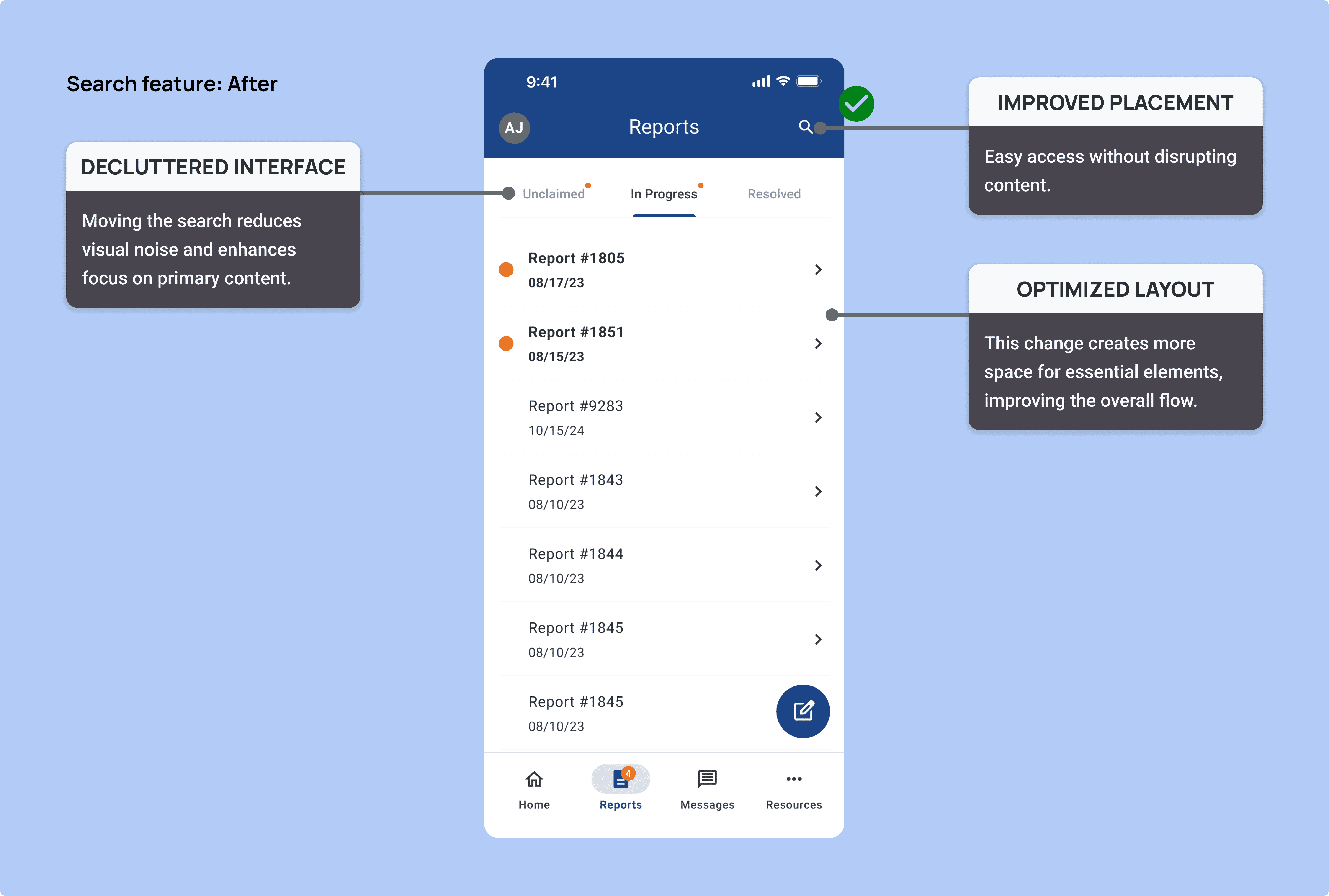
Optimized Layout: Repositioned Search for Cleaner Interface
Moved search feature to the top navigation bar to declutter the interface
This allows more focus on the main content
Search is still accessible when required
By hiding the search feature this reduced distractions by 25%, fewer distractions mean fewer input errors and a higher chance of reports being completed correctly before submission
New Report


Clearer Call to Action: Redesigned New Report Button with Bold Icon
Testing showed that report numbers placed near the new report button created visual confusing, reducing clarity
Updating the button design clarified its role as a call to action with a clear bold icon
By introducing a dedicated report button with an icon, we increased report creation by 15%, ensuring critical incidents were captured instead of being lost in paperwork
Navigation

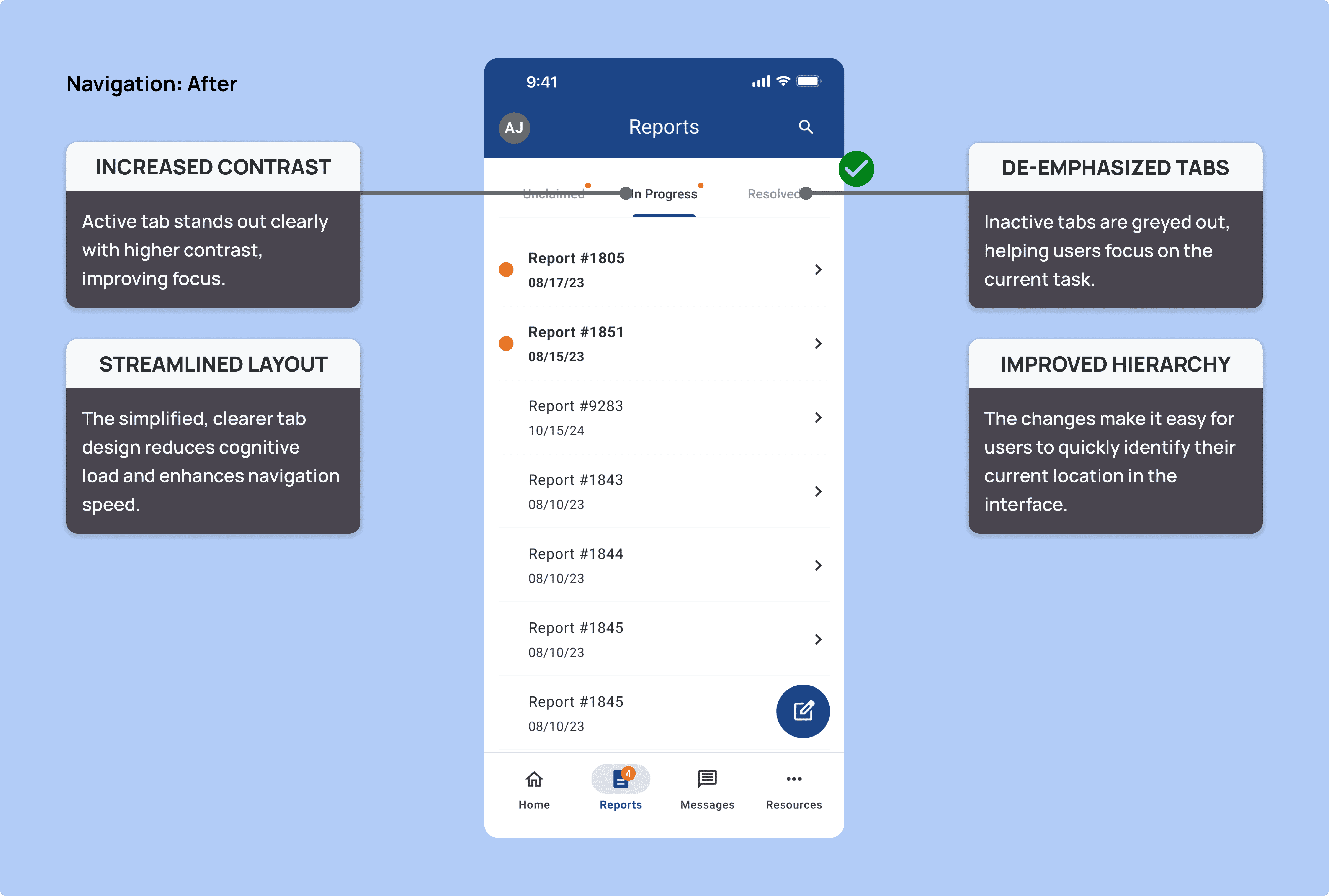
Streamlined Navigation: Improved Tab Contrast for Better Focus
Increased contrast on active tab
de-emphasized the others to reduce cognitive load
Clear visual emphasis on active tabs helped officers know exactly where they are, improving clarity by 10-25%, preventing misfiled or incomplete reports.
Ideation and prototyping
How can I make incident reporting seamless for Peace Patrol Officers?
Key Improvements Identified: Better visual hierarchy, clearer call to action for new reports, and reduced distractions.
User Insights Applied: Refined design for usability and real-world alignment.
Outcome: Improved engagement and effectiveness for peace patrol personnel.
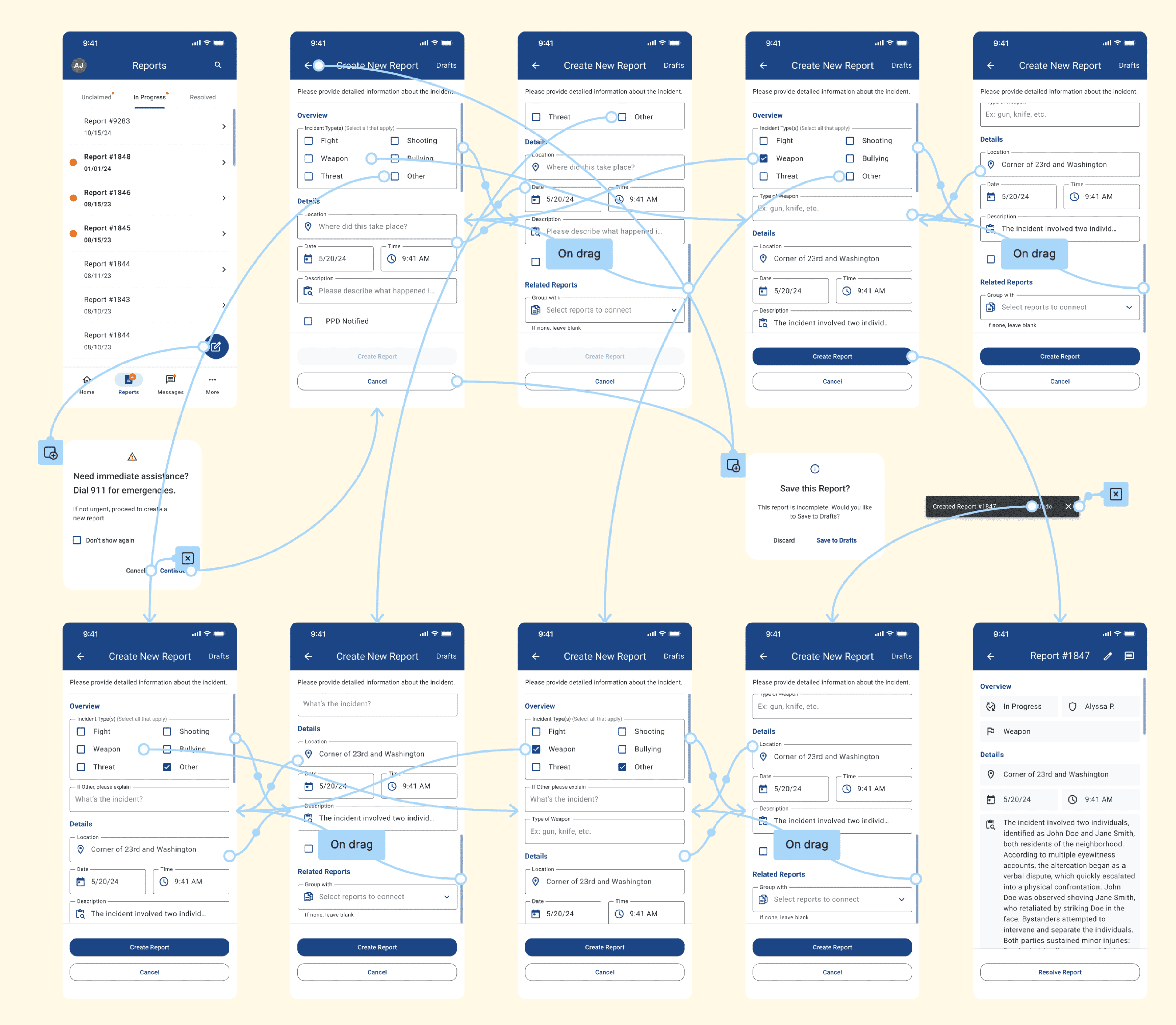
Prototype
Annotated User Flow
Impact
Redesign boosts report creation and reduces distractions
The new system not only increased report creation by 15% but also ensured every incident was properly tracked. Something that was impossible with the old paper system. While still in production, early testing shows significant improvements. Once fully launched, this system will ensure officers never lose critical incident details again.
New report button increased report creation by 15%, ensuring more incidents are documented.
Reducing distractions led to 25% fewer interruptions, minimizing input errors.
Improved tab clarity reduced misfiled reports by 10-25%, streamlining tracking and retrieval.
What's next
Conduct real-world usability testing with Peace Patrol Officers to gather feedback
Continue iterating on feedback and refine the user experience based on testing results
Integrate with back-end and desktop admin for a seamless experience