Unifying mobile and desktop with a scalable design system that boosted efficiency by 40%
I built Benchmark, a cross-platform design system that unified Philly Truce’s mobile Peace Patrol app and desktop admin platform. Before, each platform felt fragmented — different fonts, buttons, colors, and interaction patterns created confusion for users and slowed down design and development.
By creating shared foundations and reusable components, I reduced design and dev time by 40%, improved record-keeping accuracy by 15%, and made the product feel cohesive across touchpoints.
Client
Philly Truce
Timeline
4 months
My Role
Lead UX Designer
Team
Mobile / Desktop design team, Dev team, 2 Managers, 4 Content designers
Scope
Developed a Benchmark Design System for Philly Truce’s mobile web app, including reusable components, design tokens, and documentation.
40%
Reduction in design + development time via
shared system
35%
Improvement in user
satisfaction scores
15%
Increase in record-keeping accuracy by patrol officers
20%
Faster task completion in
the admin portal
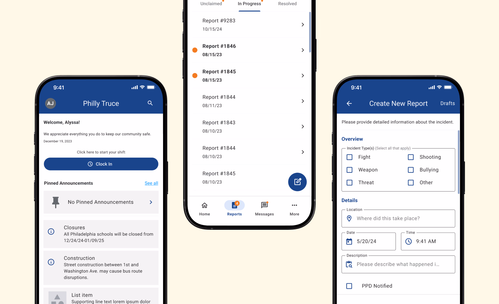
The mobile and desktop experiences looked and behaved differently, creating inconsistencies that confused users and slowed down the design and development team.
To solve this, I set out to create a unified brand and product experience across touchpoints.
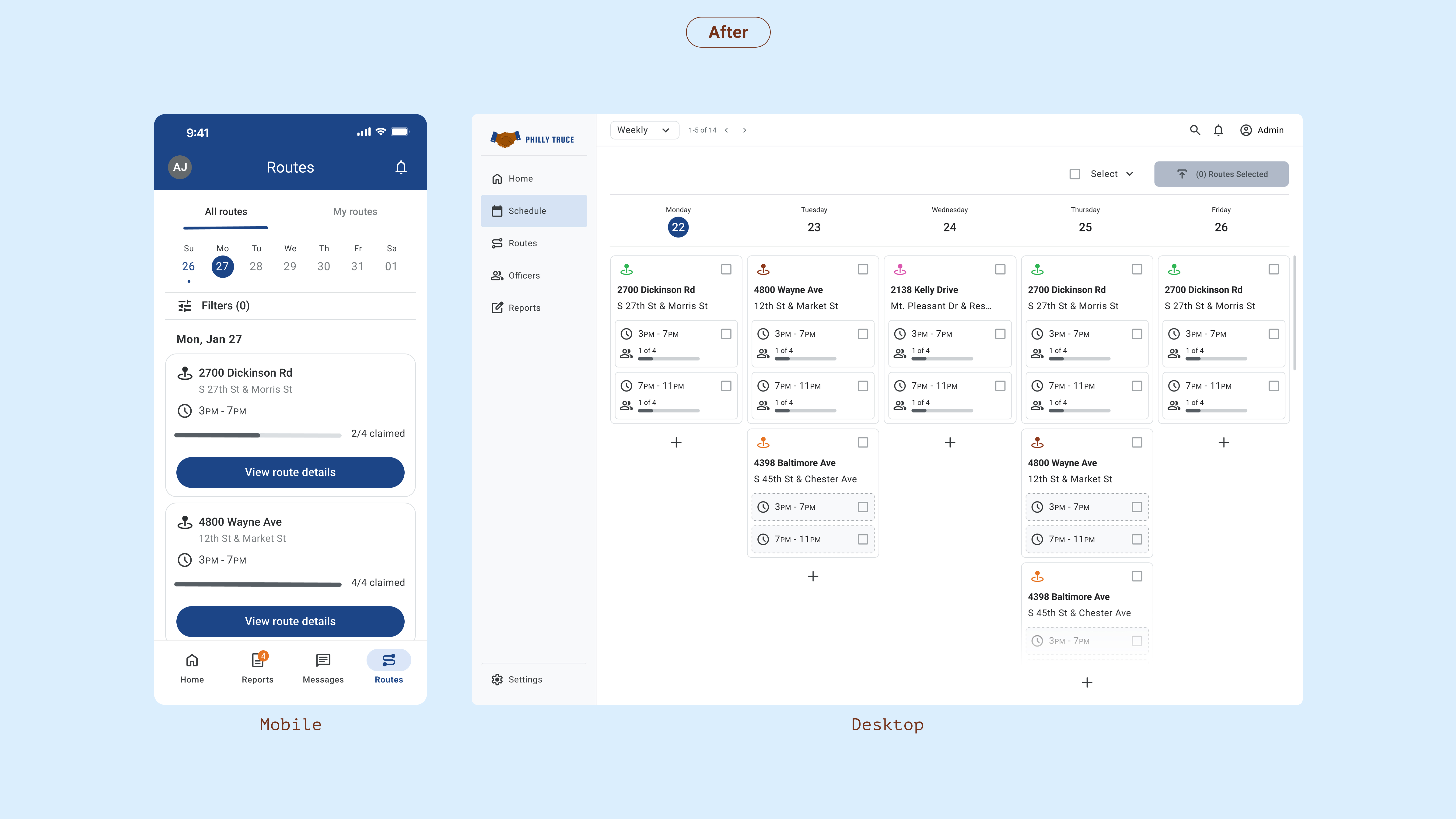
Unified typography, color, and spacing create a consistent experience across the mobile app. Buttons and toggles now meet accessibility standards, improving readability and touch targets in the field. A streamlined interface makes route cards easier to scan, while consistent iconography reduces confusion for officers on the go.
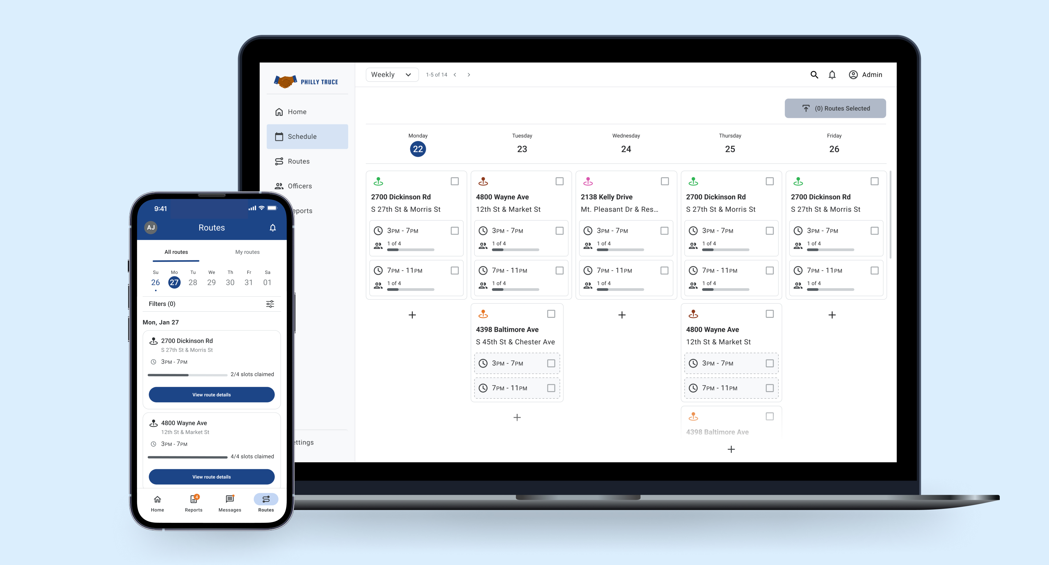
The admin portal now uses standardized tokens and components, ensuring consistent typography, color, and spacing across modules. Tables, cards, and status badges are aligned to a cohesive system, improving legibility and reducing design and development time.
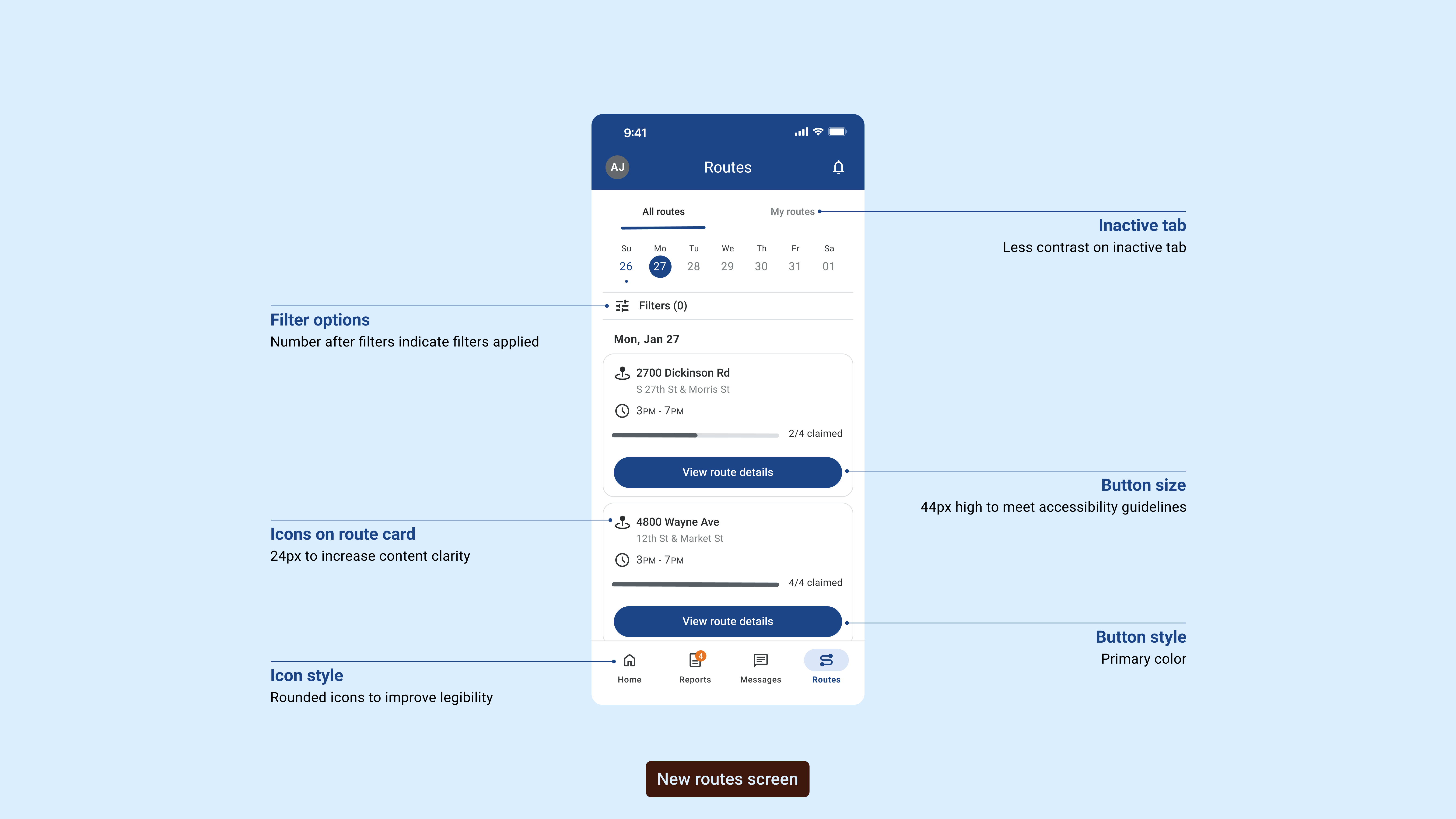
The design annotations highlight key improvements made to enhance usability and accessibility. Each element was carefully considered to create a more intuitive user experience.
From improved button sizing to meet accessibility guidelines to refined icon styles for better legibility, these changes collectively improved user satisfaction by 35%.
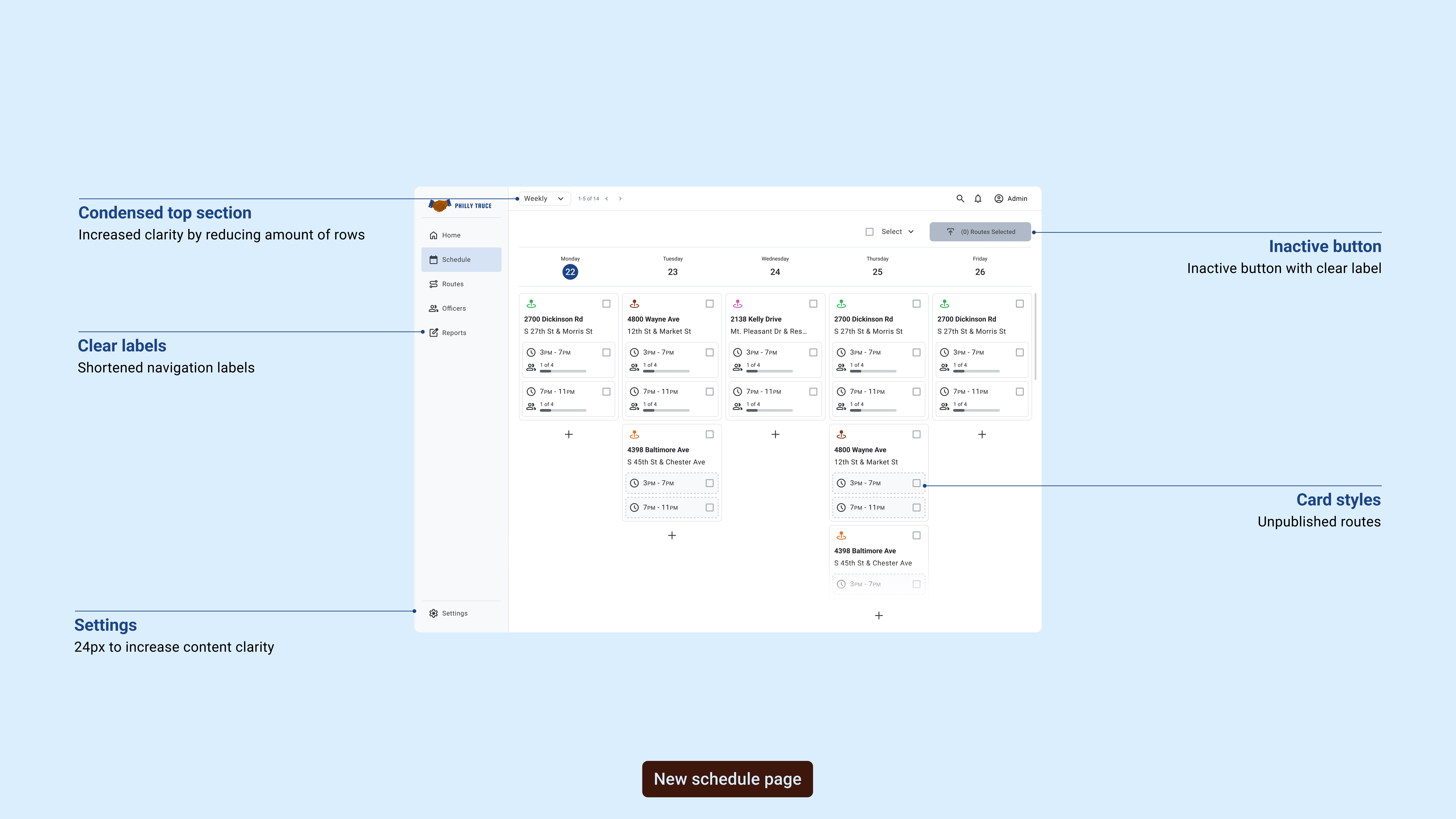
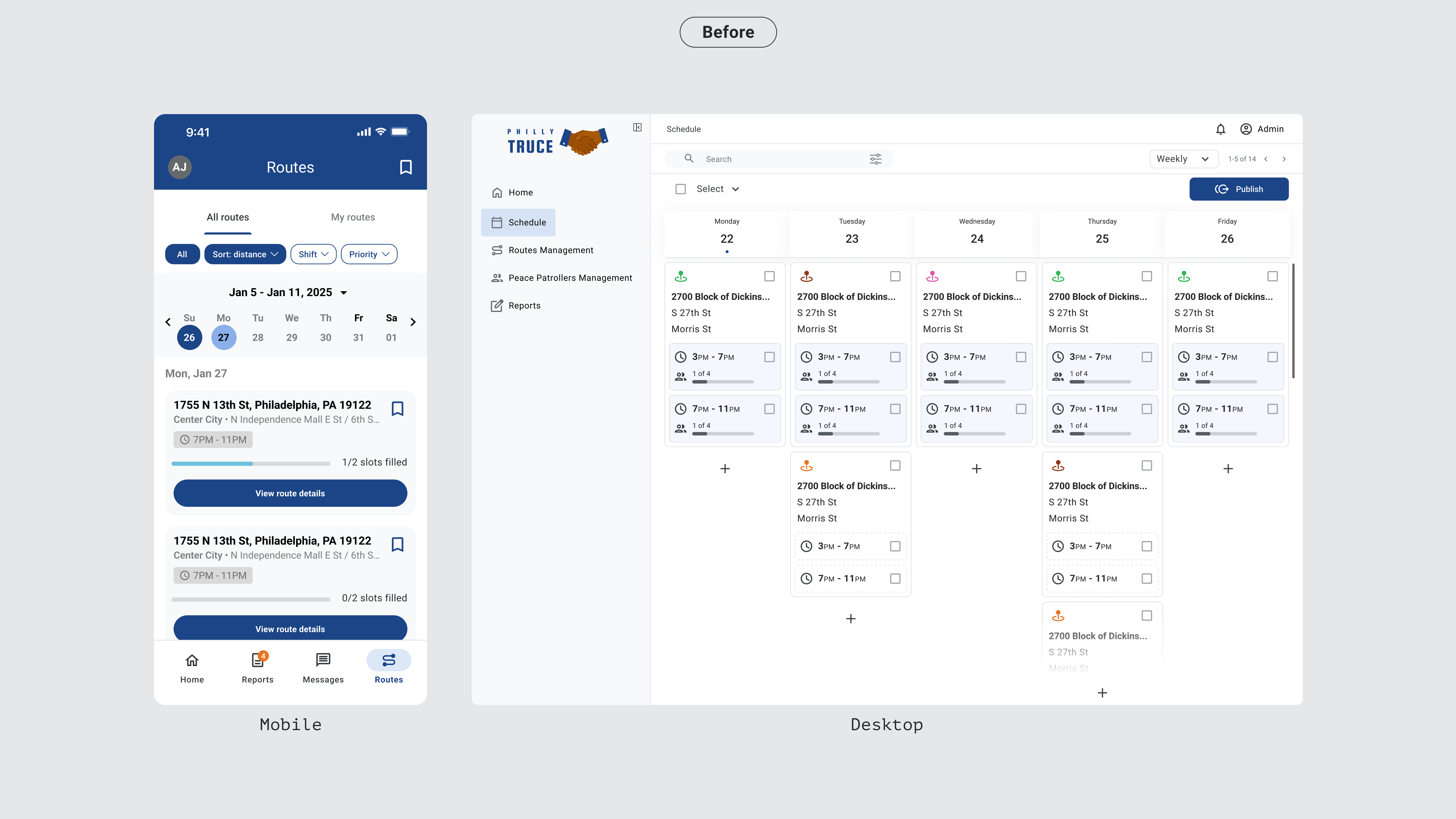
The desktop annotations showcase systematic improvements to the admin interface, focusing on clearer visual hierarchy and streamlined workflows for route management.
These desktop-specific enhancements reduced task completion time by 25% and significantly improved administrator efficiency in managing route assignments.
Audit & Discovery
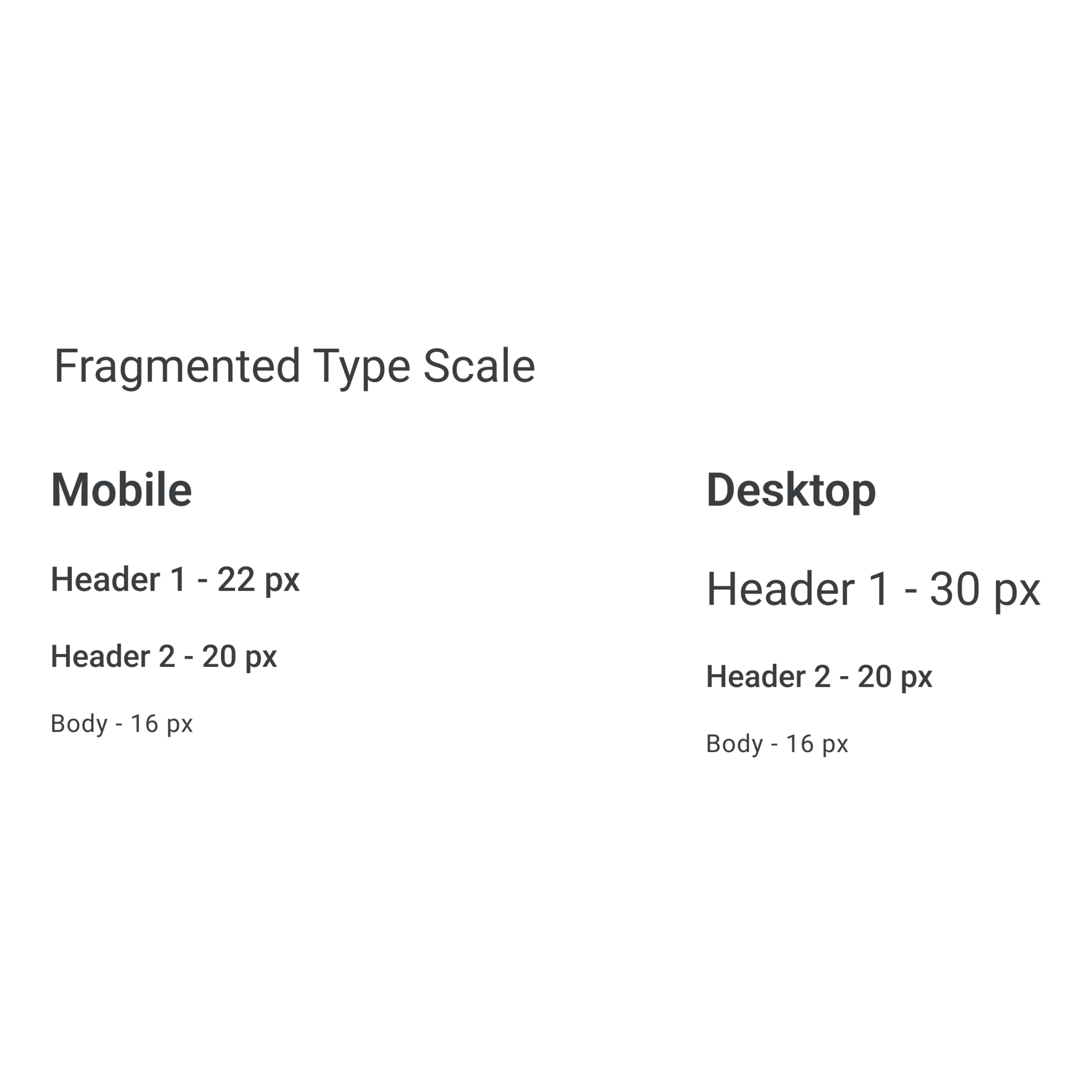
Typography
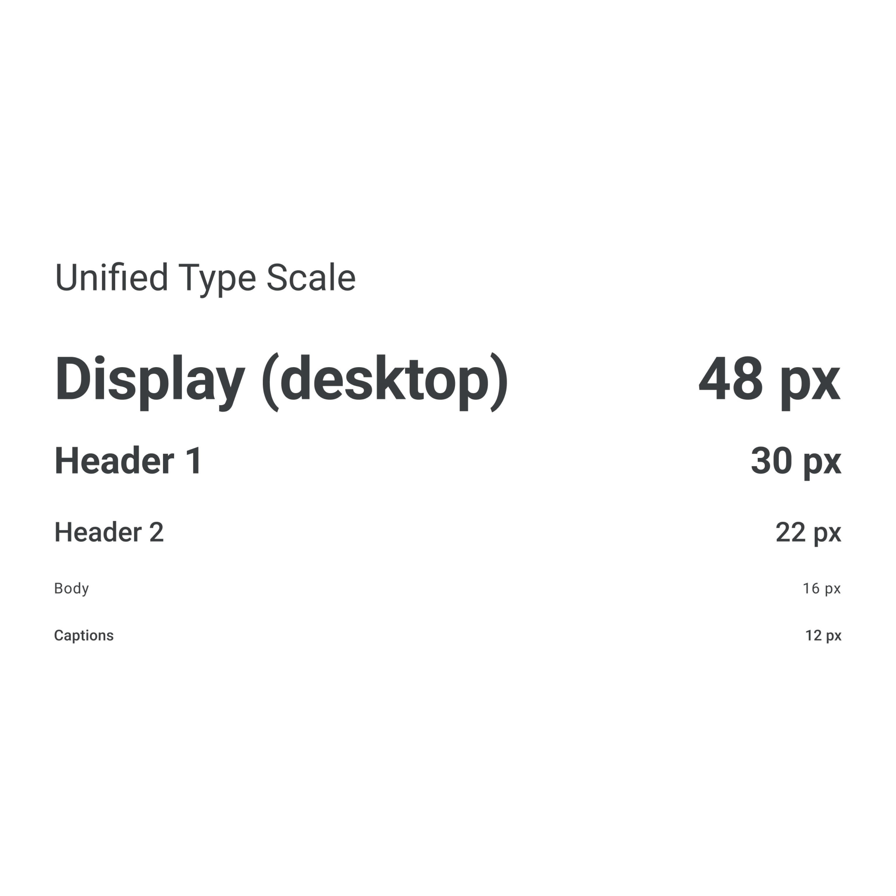
We audited typography across both platforms, identifying inconsistencies in font families, sizes, weights, and line heights that created visual discord and readability issues.
Color
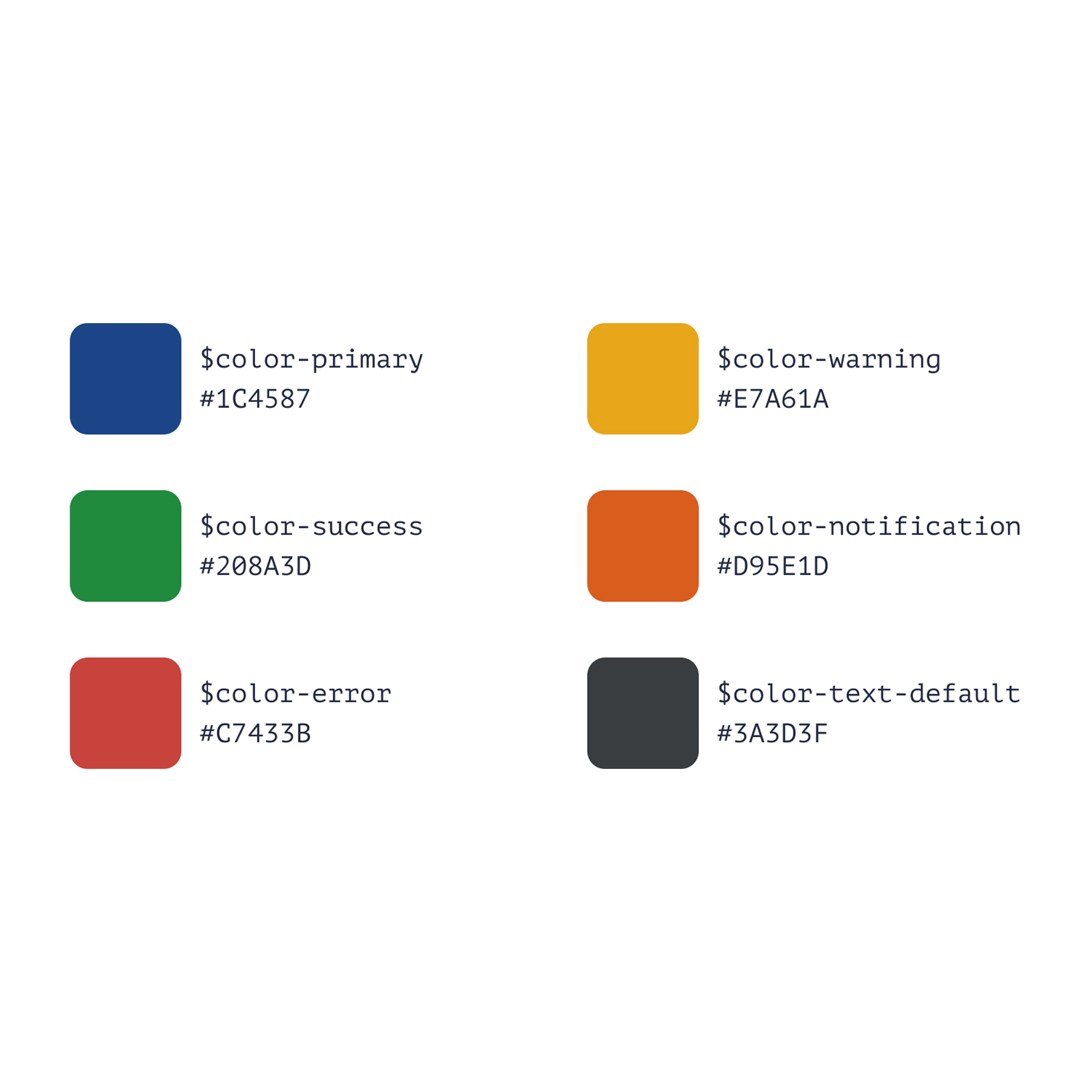
Our color audit revealed inconsistent palettes and insufficient contrast ratios that failed accessibility standards, requiring a unified approach to color tokens and usage guidelines.
Components
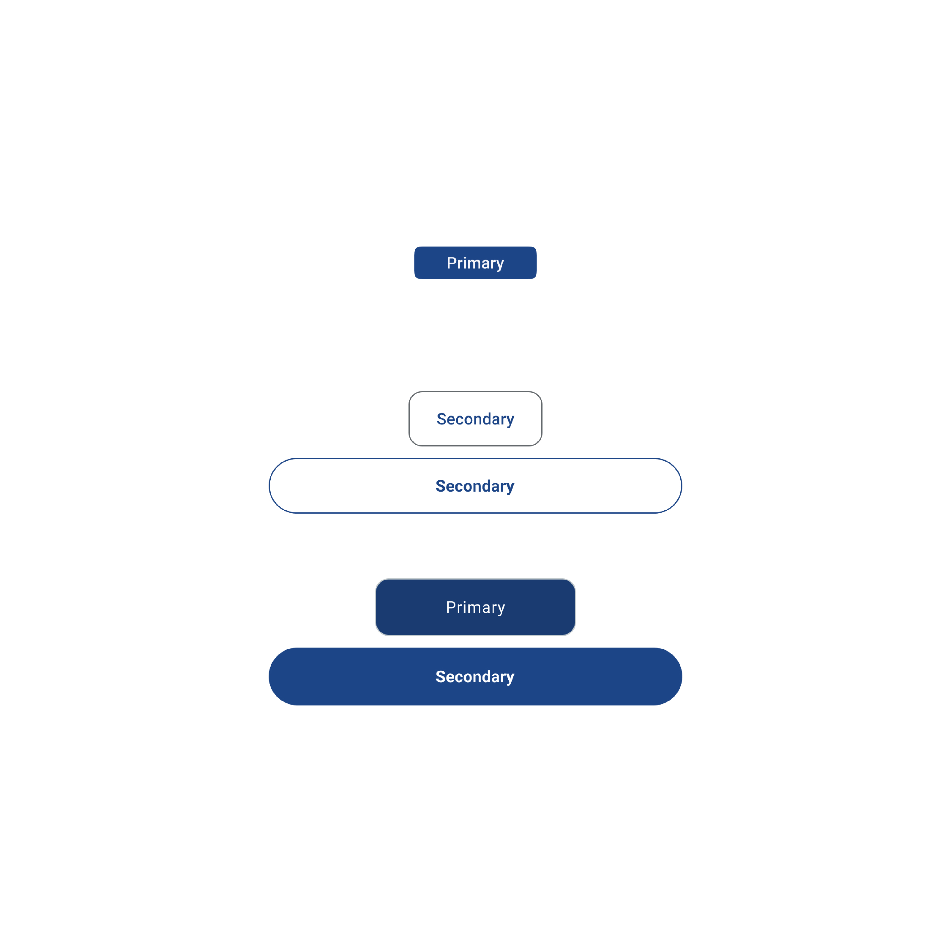
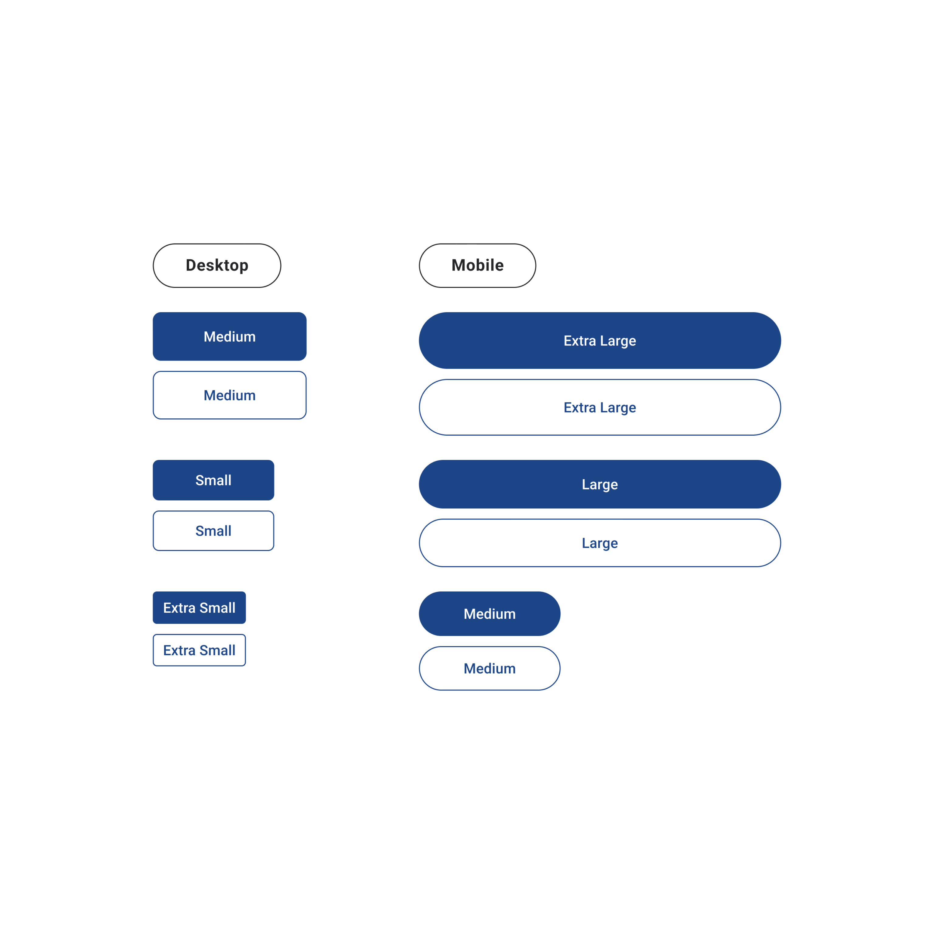
We cataloged all existing UI components across platforms, identifying duplicates, variations, and gaps that needed consolidation into a unified component library.
Aligning Foundations
Typography
Established a unified type scale and hierarchy that works seamlessly across mobile and desktop, improving readability and brand consistency.
Color
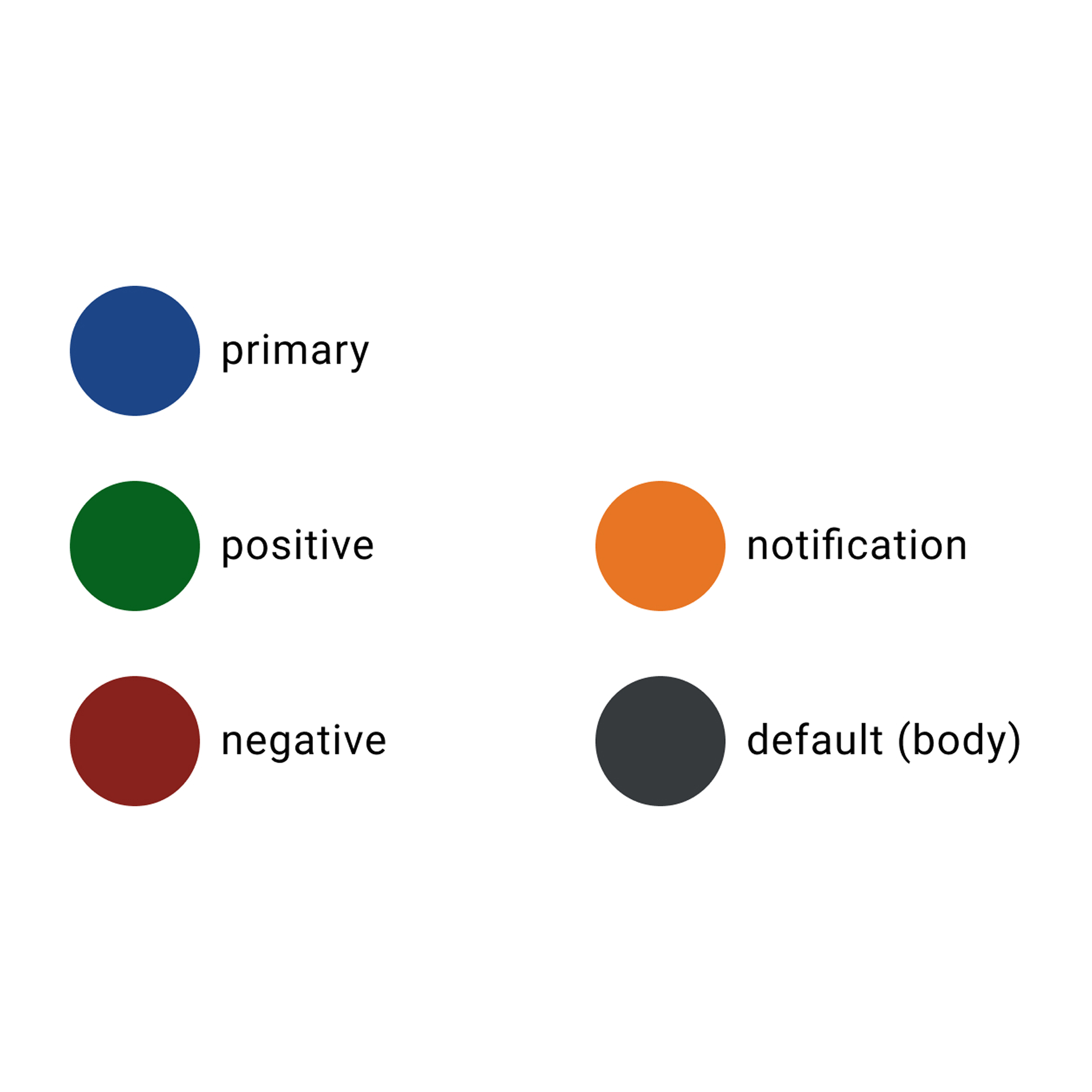
Created an accessible color system with consistent tokens for primary, secondary, and semantic colors that meet WCAG AA standards.
Components
Designed and documented a library of reusable components with variants, states, and usage guidelines for faster implementation.
The Benchmark design system unified Philly Truce's mobile and desktop experiences through shared design tokens, reusable components, and comprehensive documentation. Every element—from typography and color to buttons and forms—was standardized to create a cohesive product experience.
The system included accessibility guidelines, responsive patterns, and clear implementation specs that empowered both designers and developers to work faster and more confidently.
By establishing a single source of truth, we eliminated design debt, reduced inconsistencies, and created a scalable foundation that could grow with the product. The system became the backbone for all future feature development.
Cross-functional collaboration improved significantly as designers and developers spoke the same language, referencing the same components and patterns throughout the development process.
What Worked Well
Starting with a comprehensive audit gave us a clear picture of the problems we needed to solve. Building the system collaboratively with developers ensured buy-in and smooth implementation. The documentation became an invaluable resource that continues to guide the team.
Focusing on accessibility from the start meant we didn't have to retrofit components later, saving time and ensuring a better experience for all users.
What I'd Do Differently
I would have involved more end users earlier in the process to validate component patterns before full implementation. While we tested thoroughly, earlier user feedback could have caught edge cases sooner.
I'd also establish a more formal governance process from day one to manage component requests and updates as the system scales. This would help maintain consistency as more teams adopt the system.