0-1 design system for a web3 gaming community
Built a scalable design system for Soulbound, enabling consistent user experiences across the web3 gaming ecosystem while supporting rapid feature development.
The system established visual patterns, reusable components, and clear guidelines that transformed how the team approached design and development.
Client
Soulbound
Timeline
3 months
My Role
UX Designer
Team
2 UX Designers, 3 Developers, 1 Product Manager
Scope
Design System, Component Library, Visual Design
30%
Less time recreating components for new screens
25%
Reduction in design inconsistencies
100%
Of text and UI elements now meet WCAG AA color contrast standards
Soulbound design system video demonstration
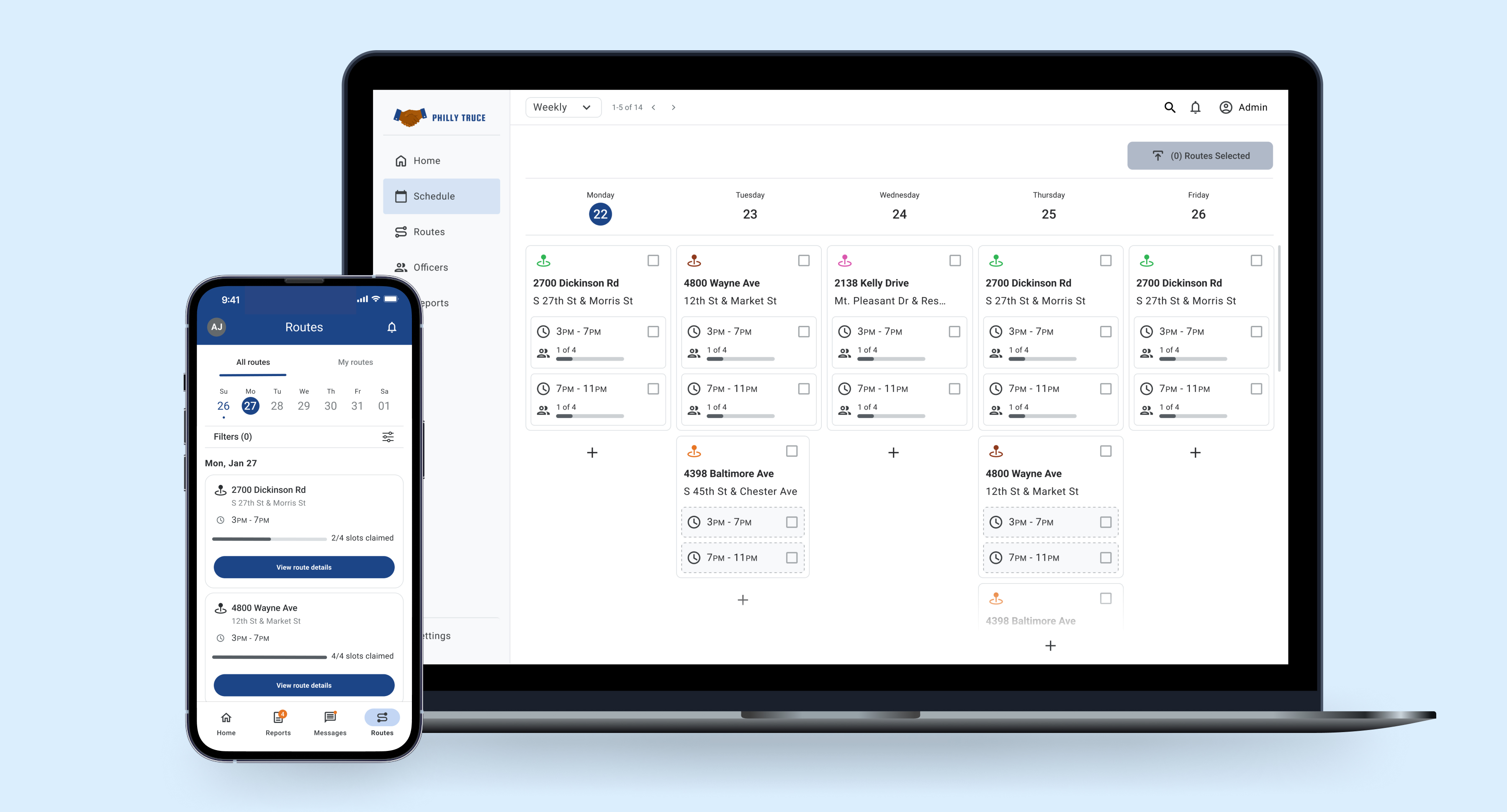
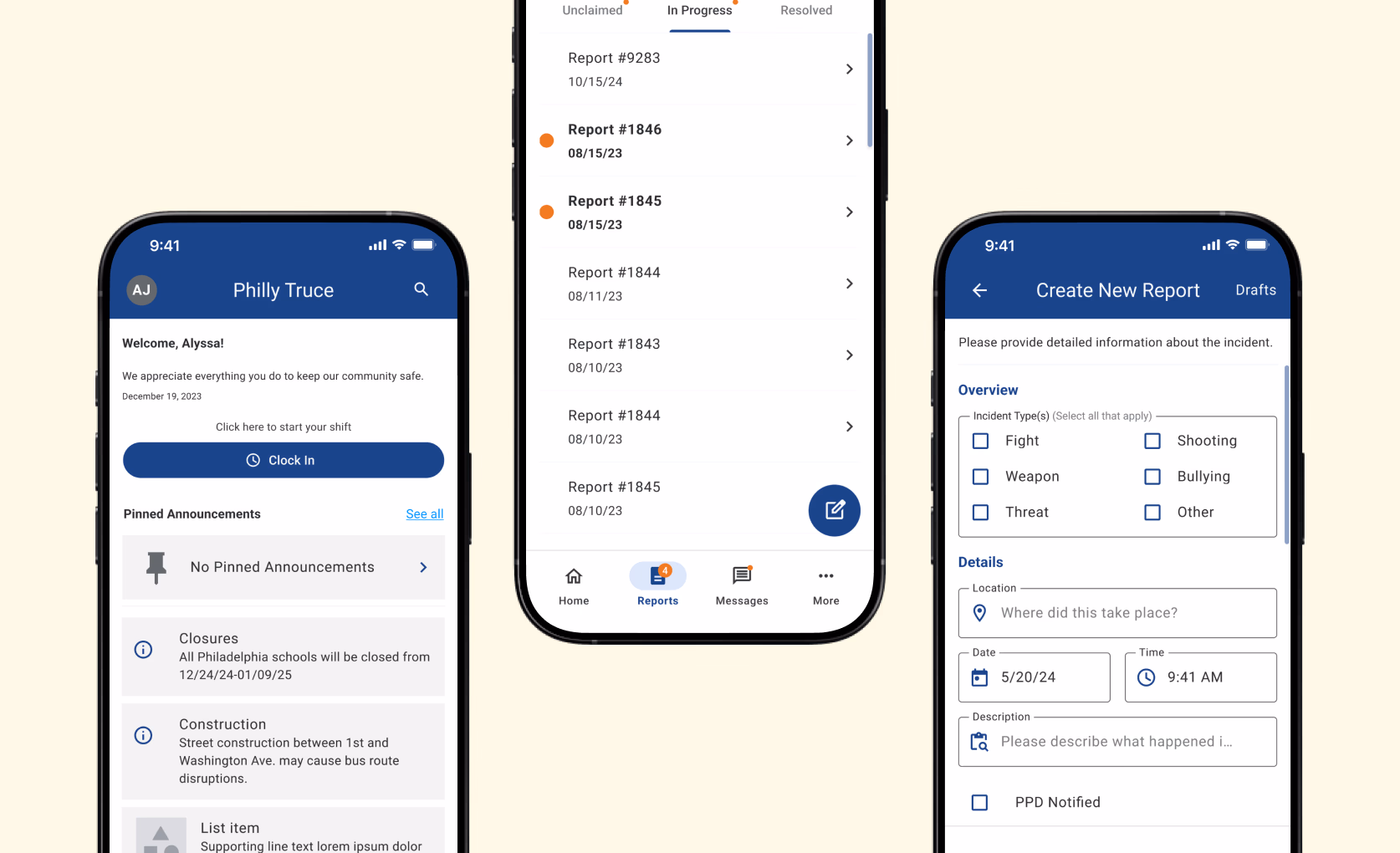
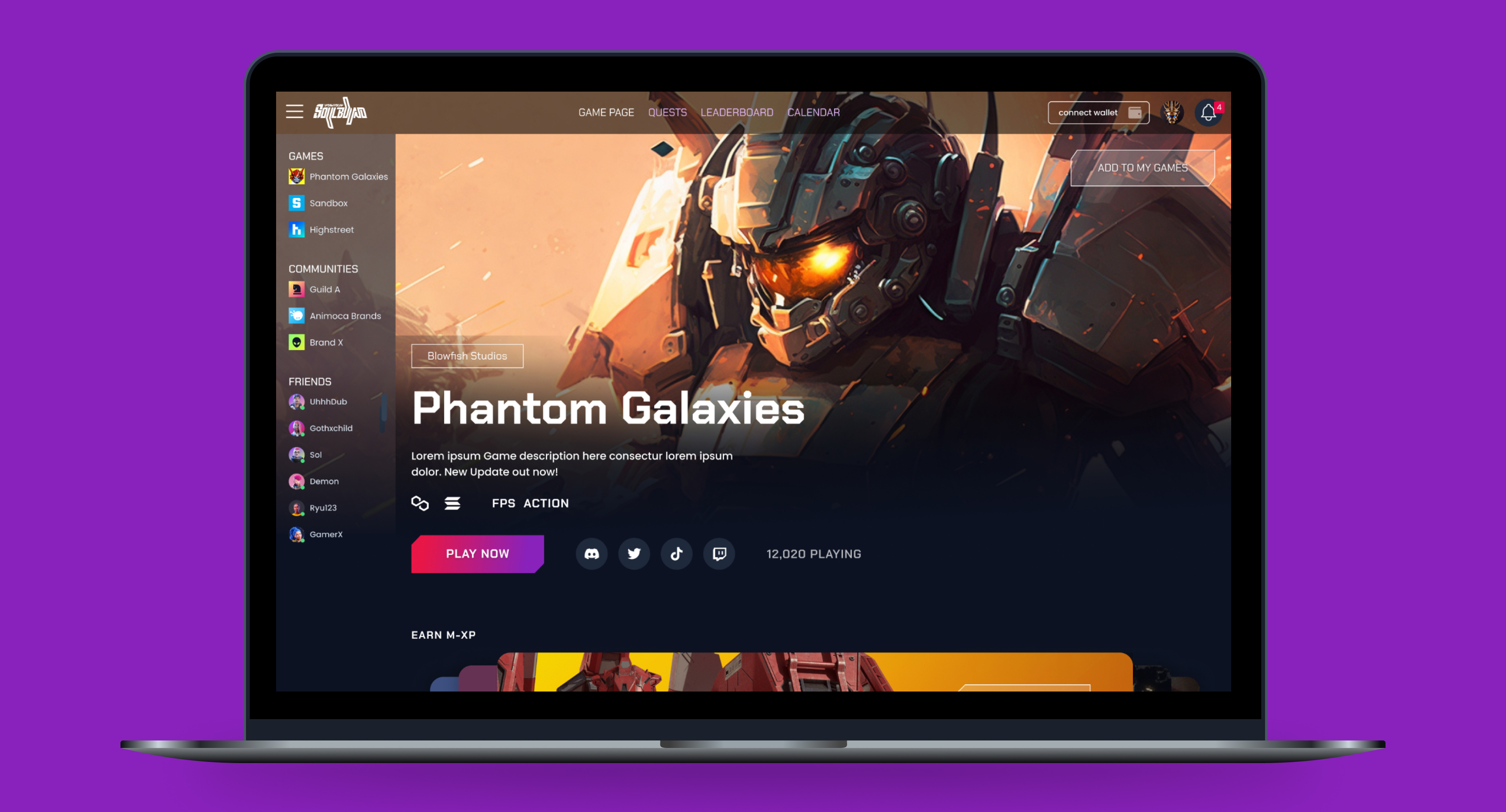
Establish a Cohesive Design System
consistent typography, colors, spacing, and UI components across the platform.
Enhance UI Consistency and Scalability
Integrate branding, accessibility, and stylistic touches to enhance aesthetics.
Elevate the Visual Identify of Platform
Support growth and features with a consistent, recognizable brand identity.
I established a unified design system from the ground up, defining typography, color palettes, spacing, and reusable components. This system created consistency across interfaces, streamlined design and development, and reinforced a cohesive, scalable brand identity.
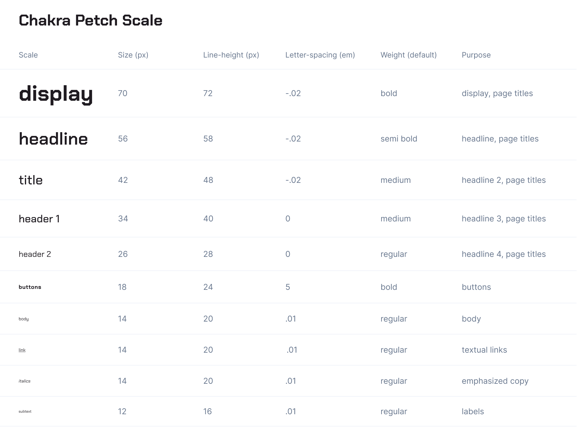
The Chakra Petch scale establishes a bold, tech-forward typographic hierarchy designed for high-impact moments across the platform.
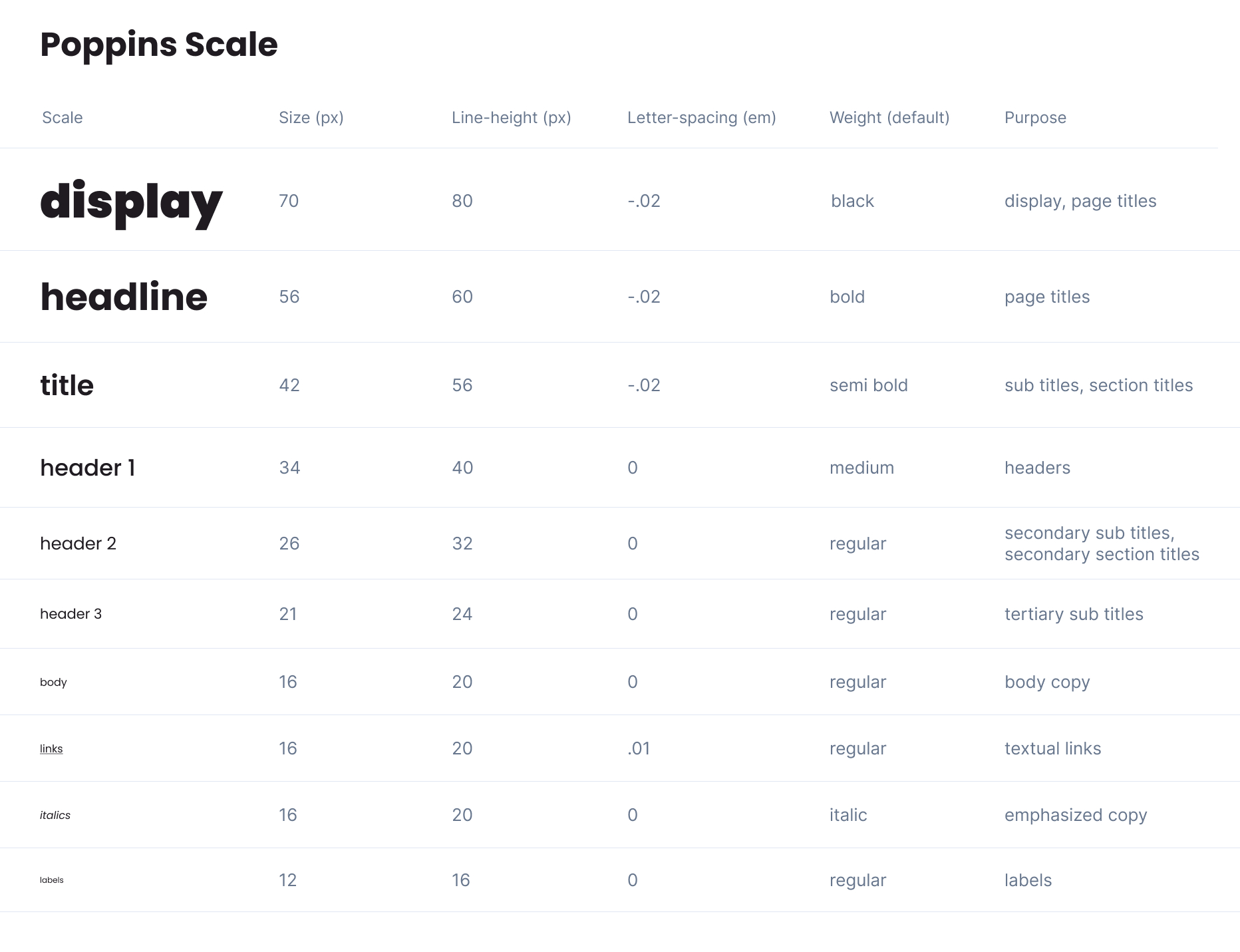
The Poppins scale provides a clean, modern, and highly legible counterpart to the more expressive display typography.
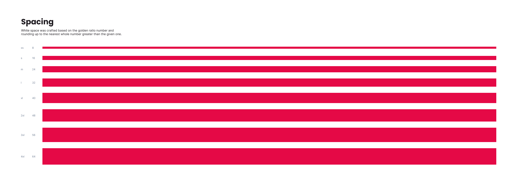
Built on the golden ratio and rounded to whole numbers, this spacing system creates a consistent, scalable rhythm and clear visual hierarchy.
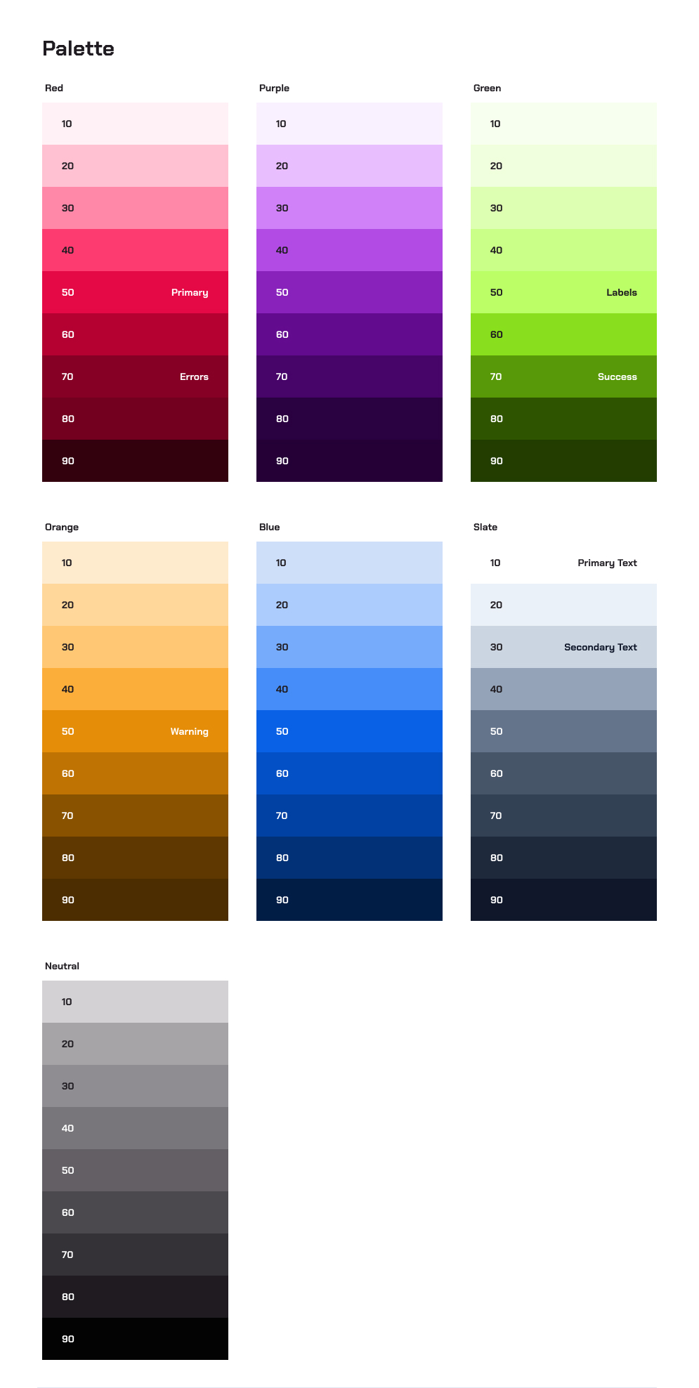
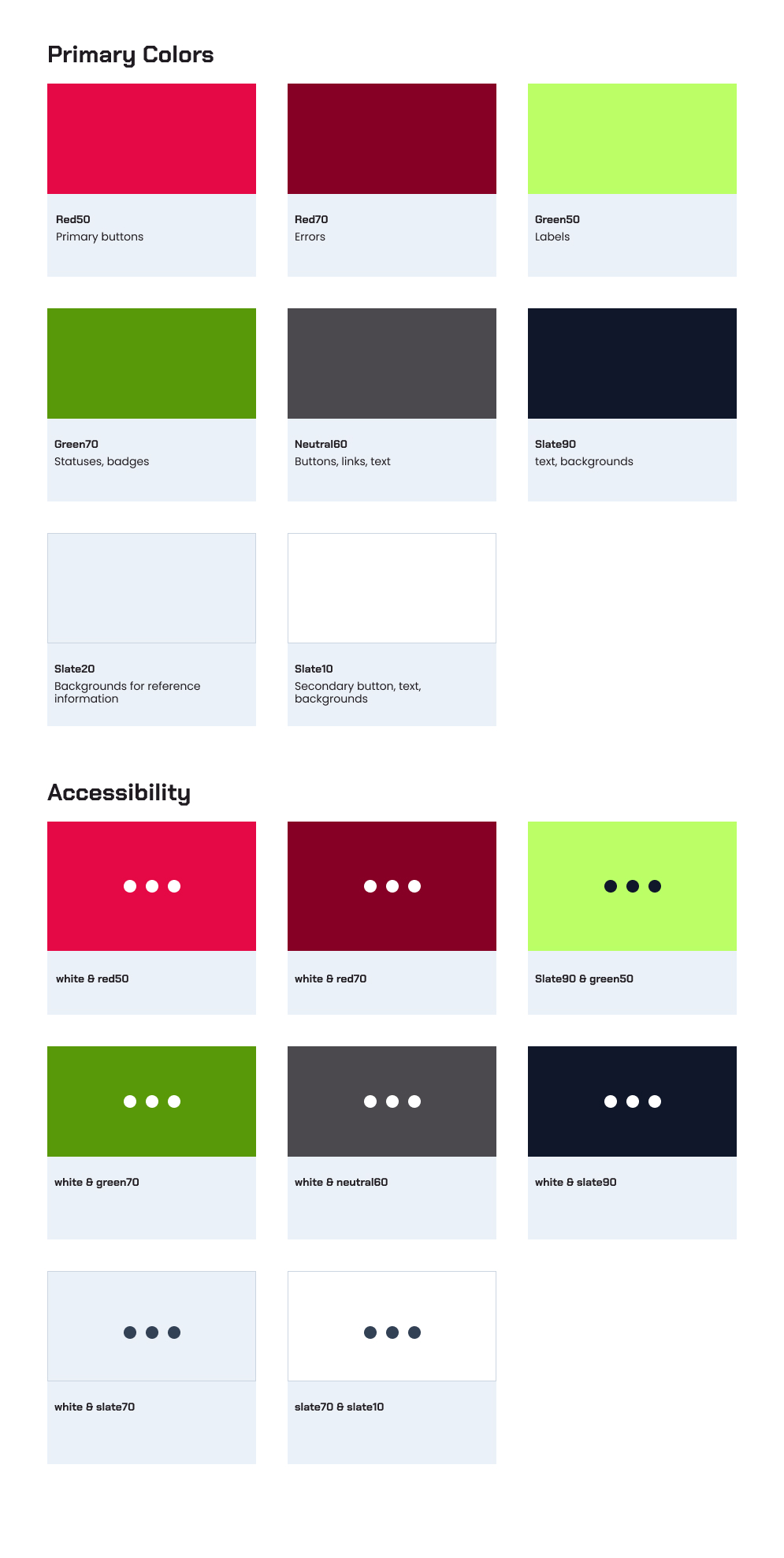
The color palette and accessibility standards ensure vibrant brand expression while maintaining WCAG AA compliance for all text and UI elements.
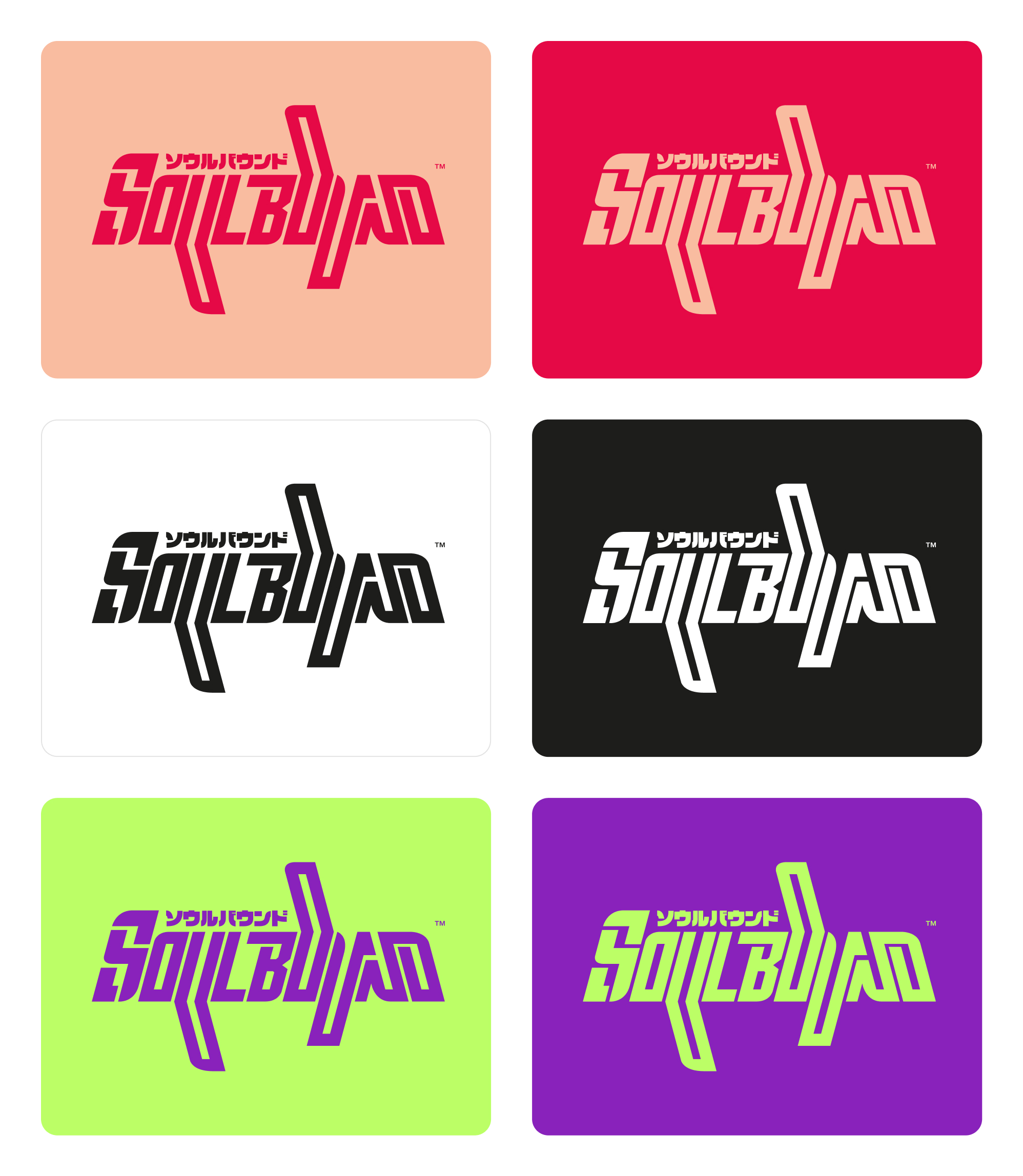
Six logo variations provide flexibility across diverse backgrounds while maintaining brand consistency and recognition.
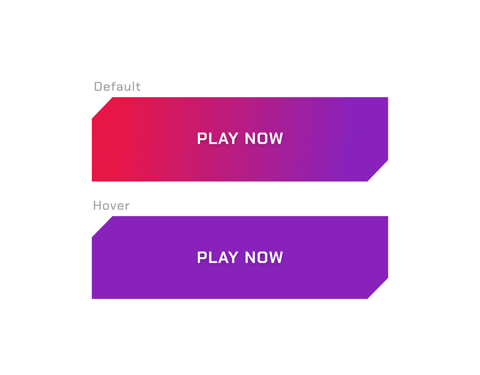
Button states demonstrate clear interaction feedback with default and hover for visual clarity.