Reducing violence by improving
record-keeping accuracy by 15%
Philly Truce is a Philadelphia-based grassroots organization dedicated to reducing violence through community-led intervention. Peace Patrol Officers relied on paper-based incident reports, which were time-consuming to complete, inconsistent, and difficult to access or analyze.
The goal of this project was to design a mobile-friendly digital incident reporting system that fit officers’ real-world workflows, supported fast documentation in the field, and improved data quality for operational insight and decision-making.
Client
Philly Truce
Timeline
4 months
My Role
Lead UX Designer
Team
2 Lead UX Designers, 3 UX Designers, UX Research, Developers, 1 Project Manager, 4 Content Designers
Scope
Designed a mobile digital reporting system to replace paper-based incident forms for Peace Patrol Officers.
15%
Increase in report creation with
updated new report button
25%
Reduction in distractions, minimizing interruptions and input errors
10-25%
Reduction in misfiled reports
Peace patrol officers in Philadelphia struggled with inaccurate and inconsistent record-keeping, making it difficult to track interventions and measure impact effectively. The existing system lacked usability, efficiency, and reliability, leading to operational inefficiencies and missed opportunities for violence prevention.
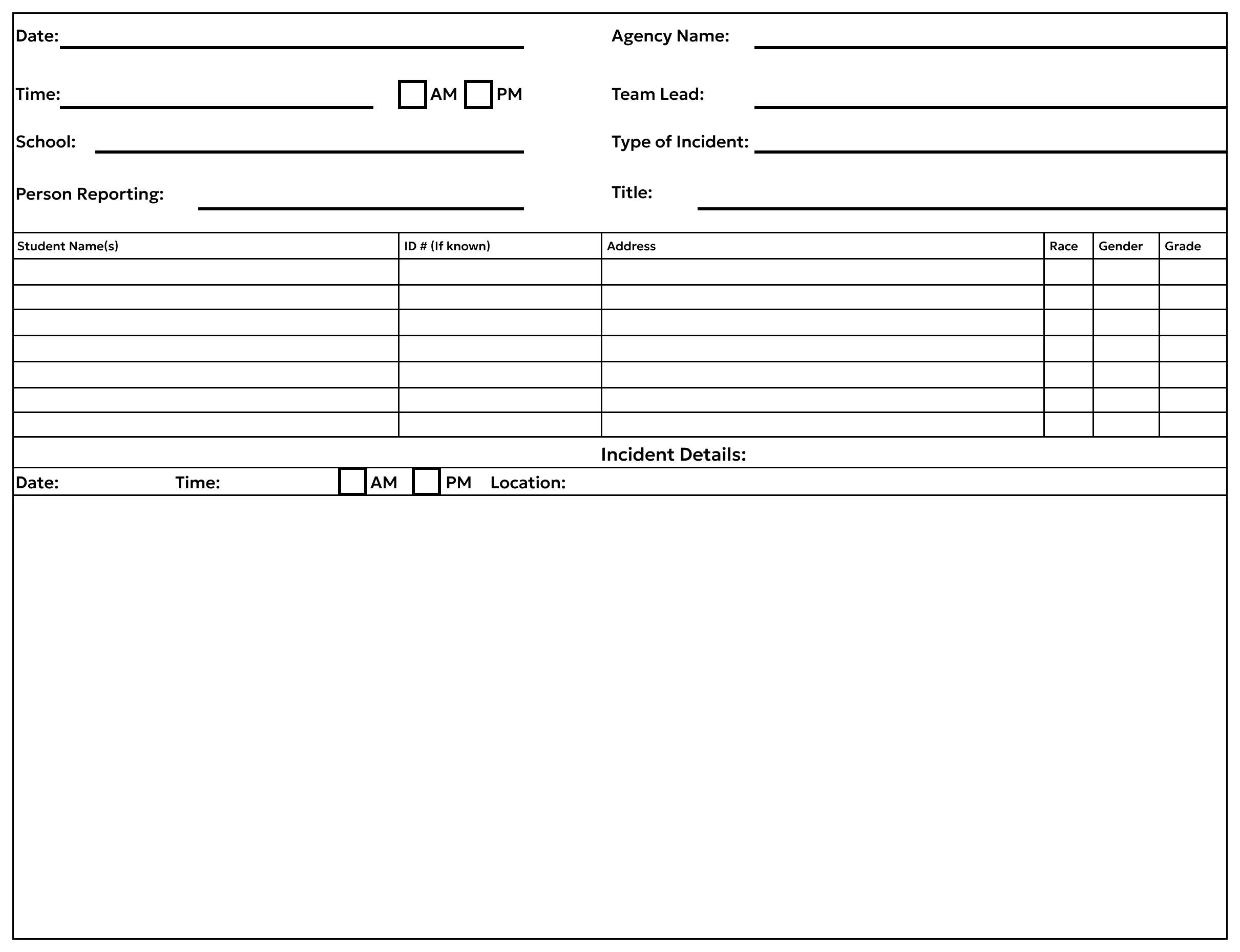
Example of how incident reports were made on paper before going digital.
Reduce Errors
Minimize data entry mistakes and incomplete fields through better form structure.
Improve Speed
Enable officers to complete reports faster using a streamlined workflow.
Enhance Data Quality
Capture complete and consistent data to improve analysis and response coordination.
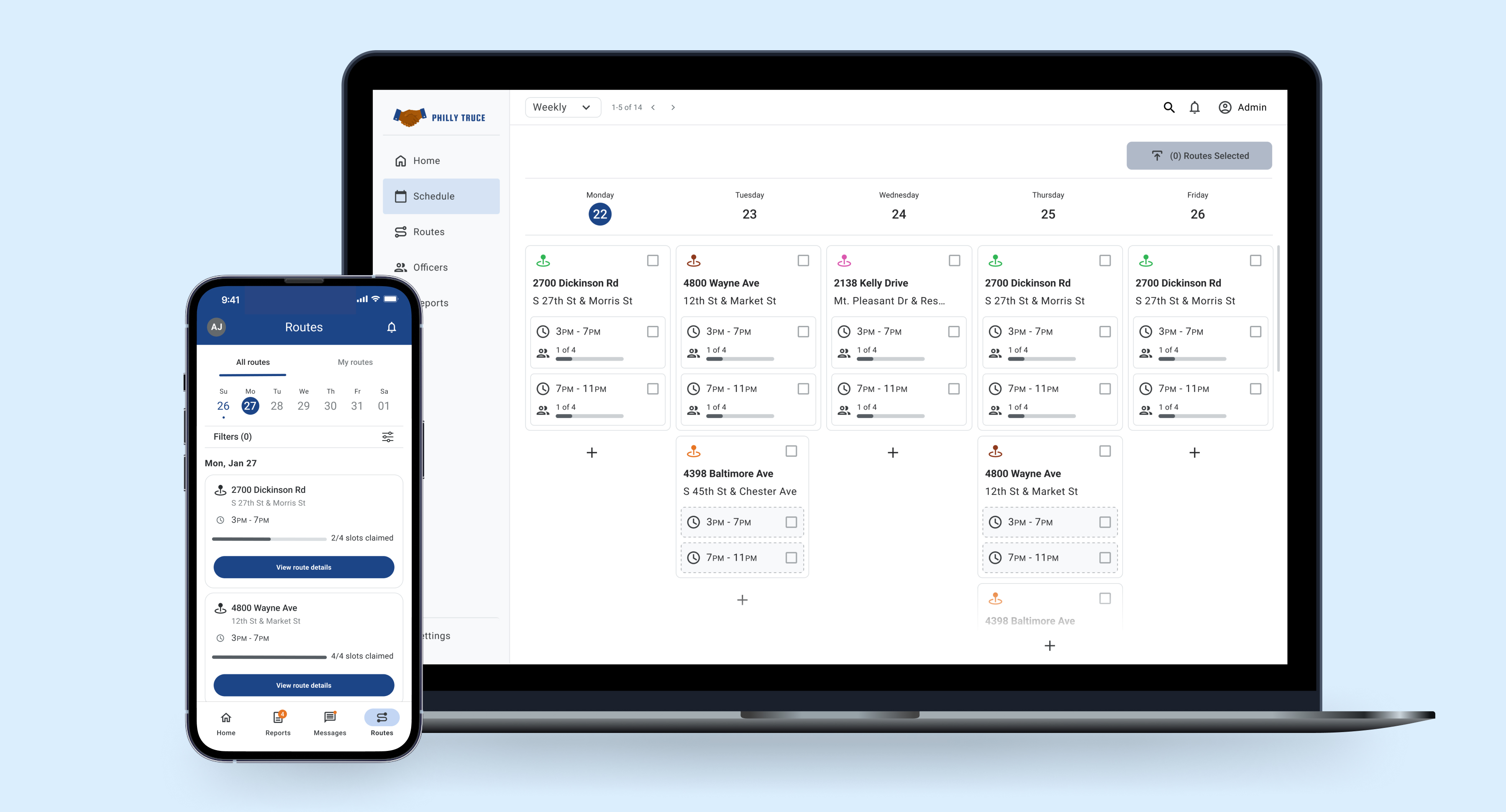
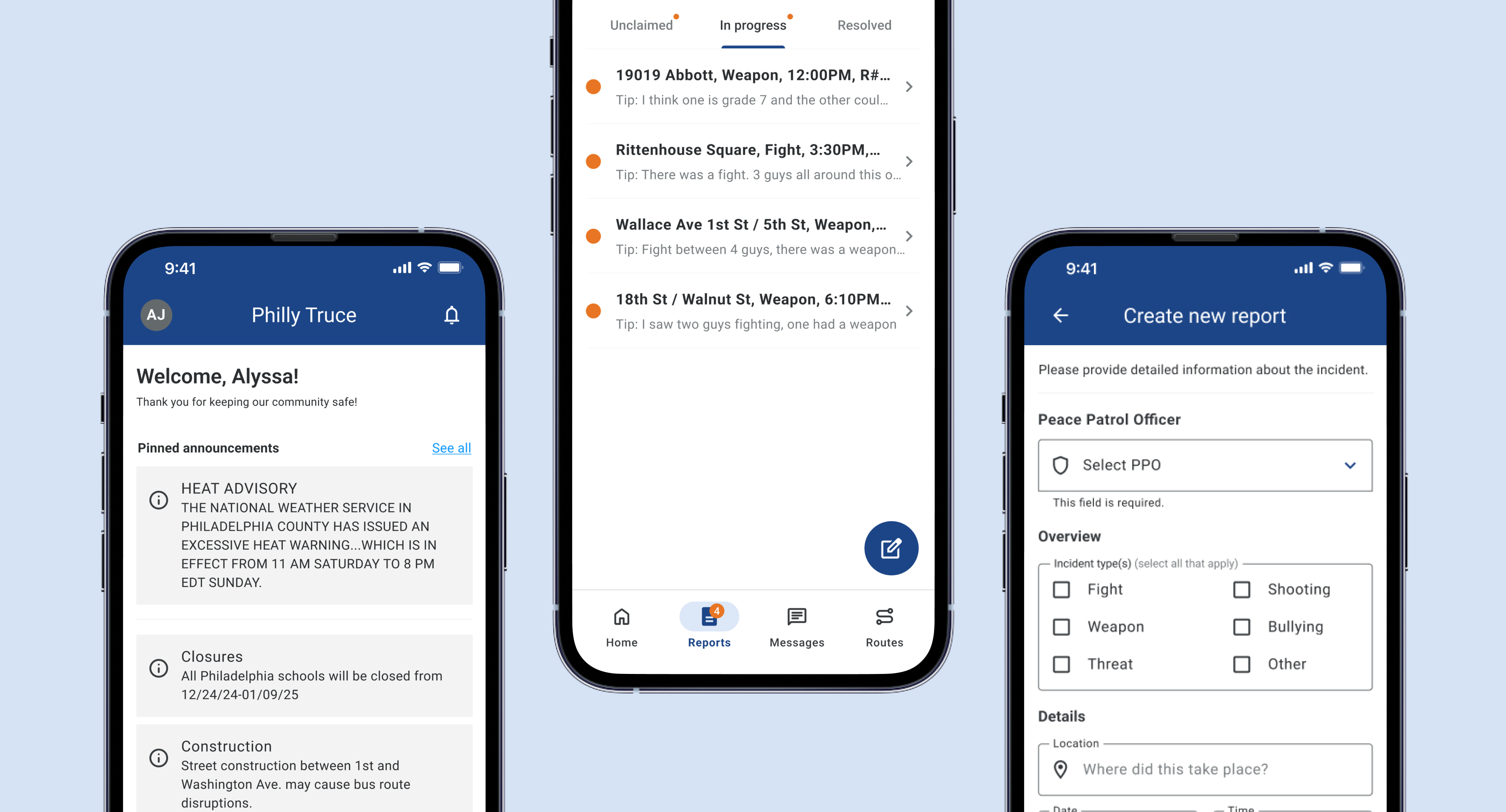
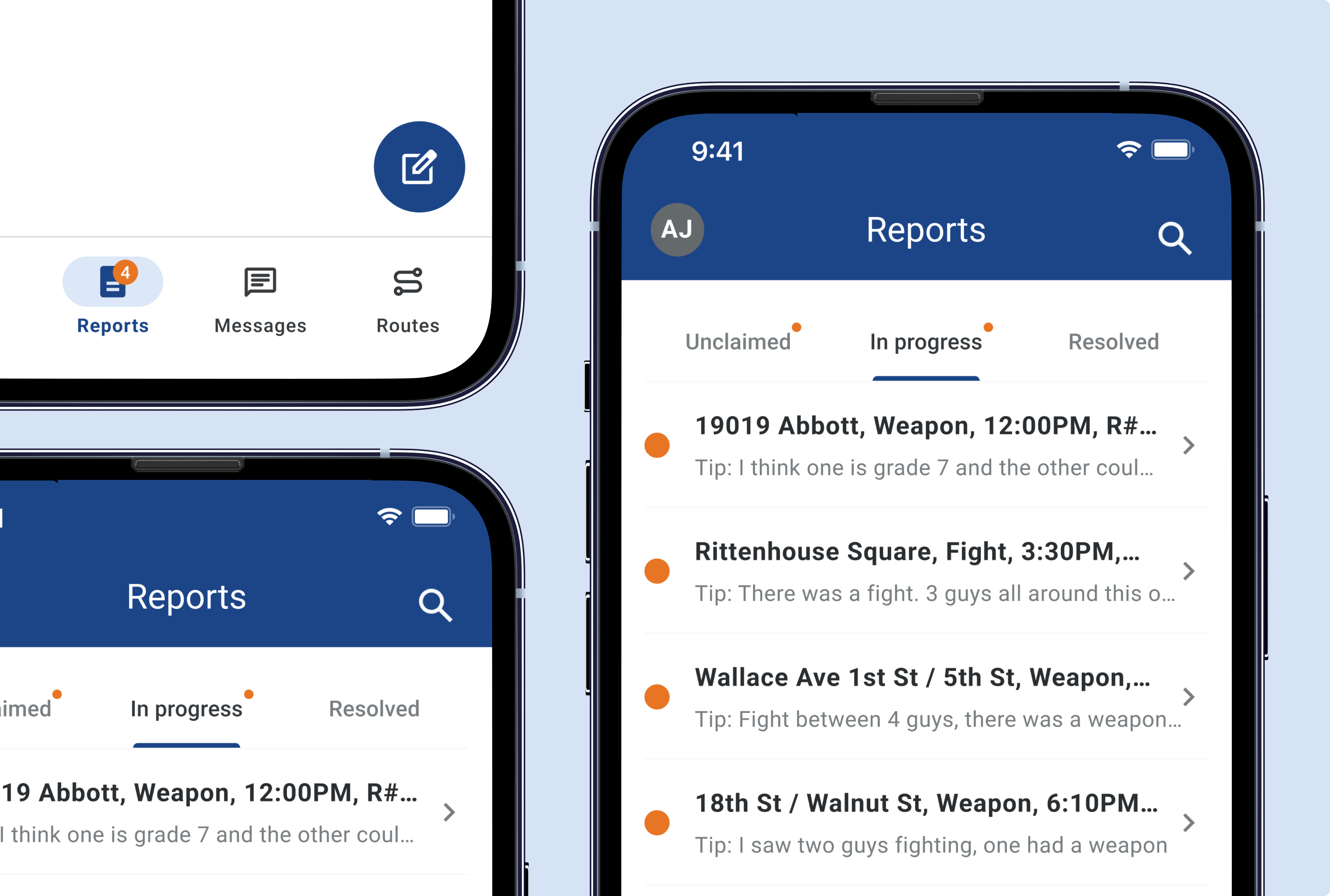
Led the design of a mobile web app to digitize incident reporting and streamline Peace Patrol Officers’ workflows.
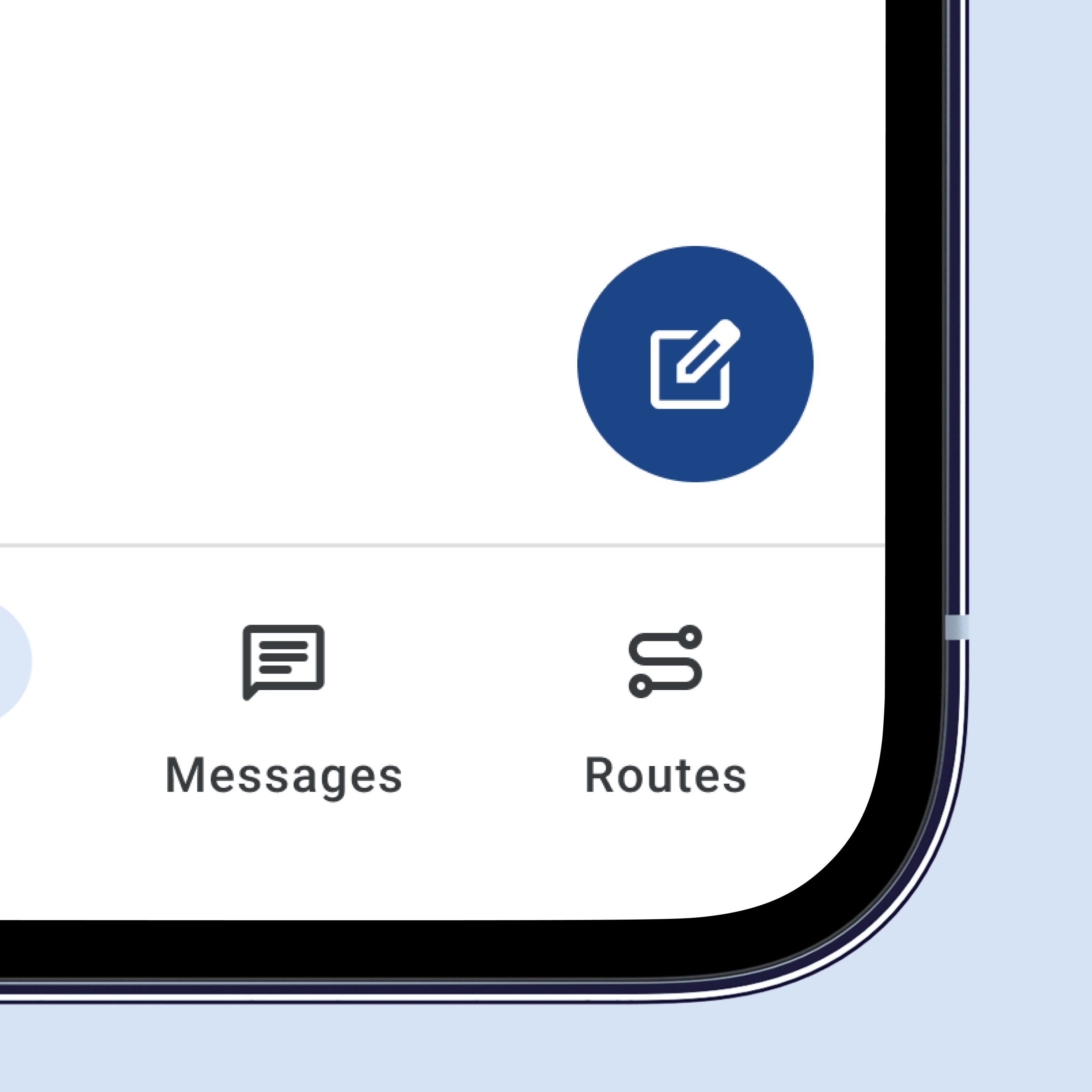
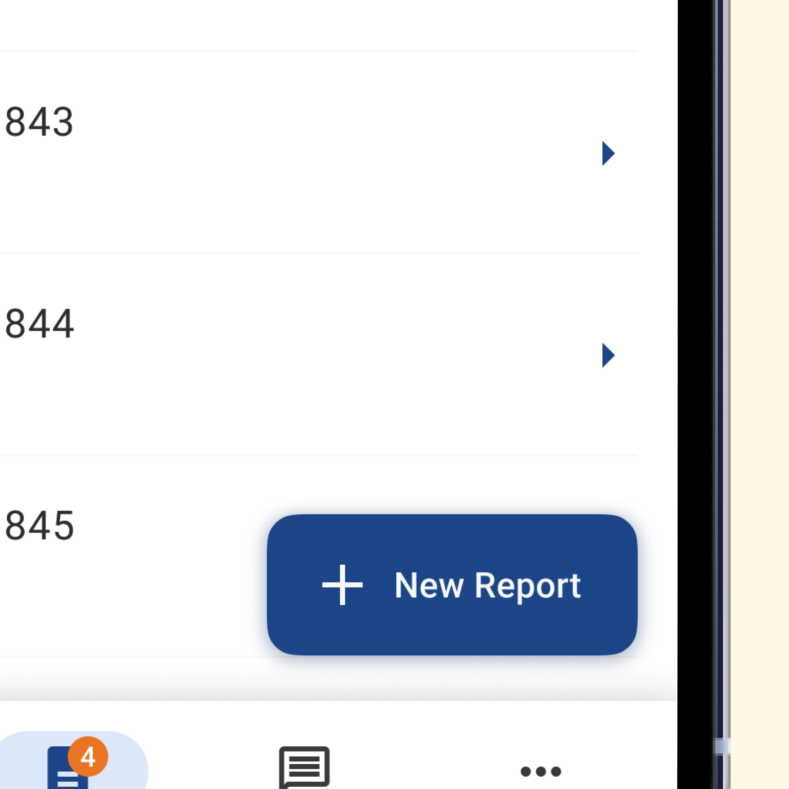
Improved Primary Action Button
Circular floating action button clearly separates the primary action from the report list.
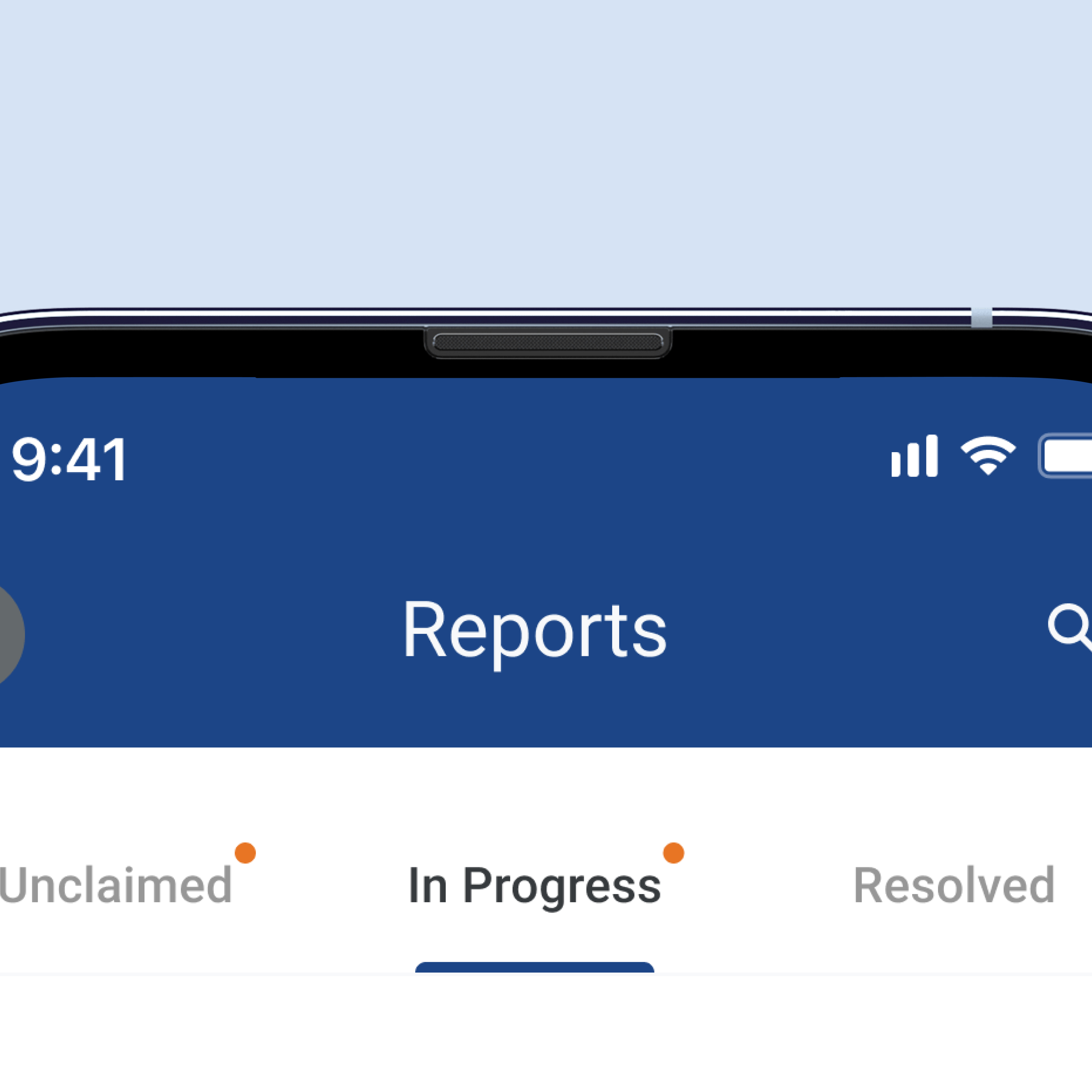
Clear Active States
Clear active states improved navigation and reduced errors.
Reduced Visual Clutter
Relocated search to a top-nav icon, reducing clutter and freeing mobile screen space.
Streamlined Interface
The redesigned interface provides a clear, intuitive experience for Peace Patrol Officers.
We conducted extensive user research with Peace Patrol Officers to understand their workflows, pain points, and requirements.
Action button confused users
Button size and placement caused user confusion.
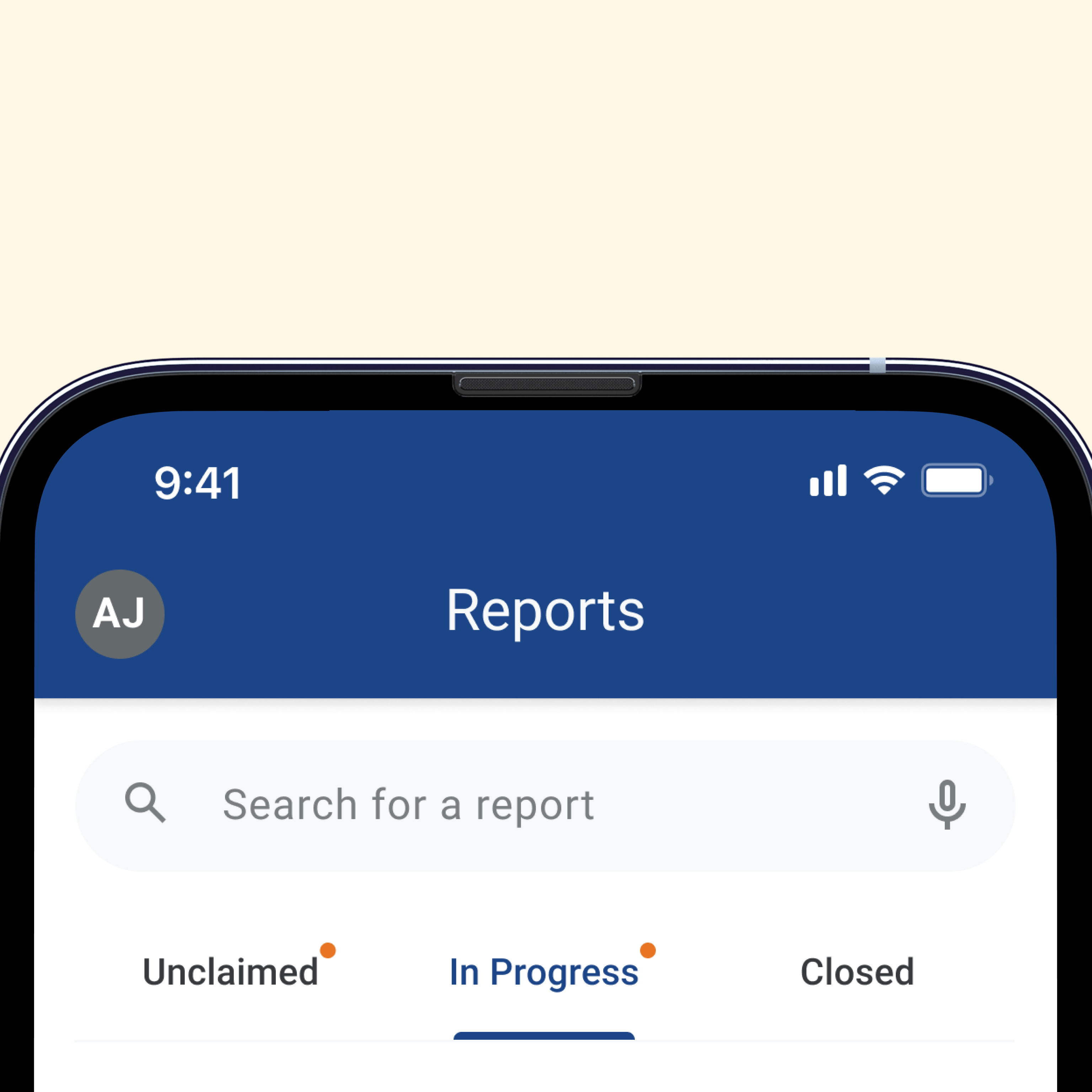
Navigation lacked clarity
Active and inactive tabs weren’t visually distinct for users.
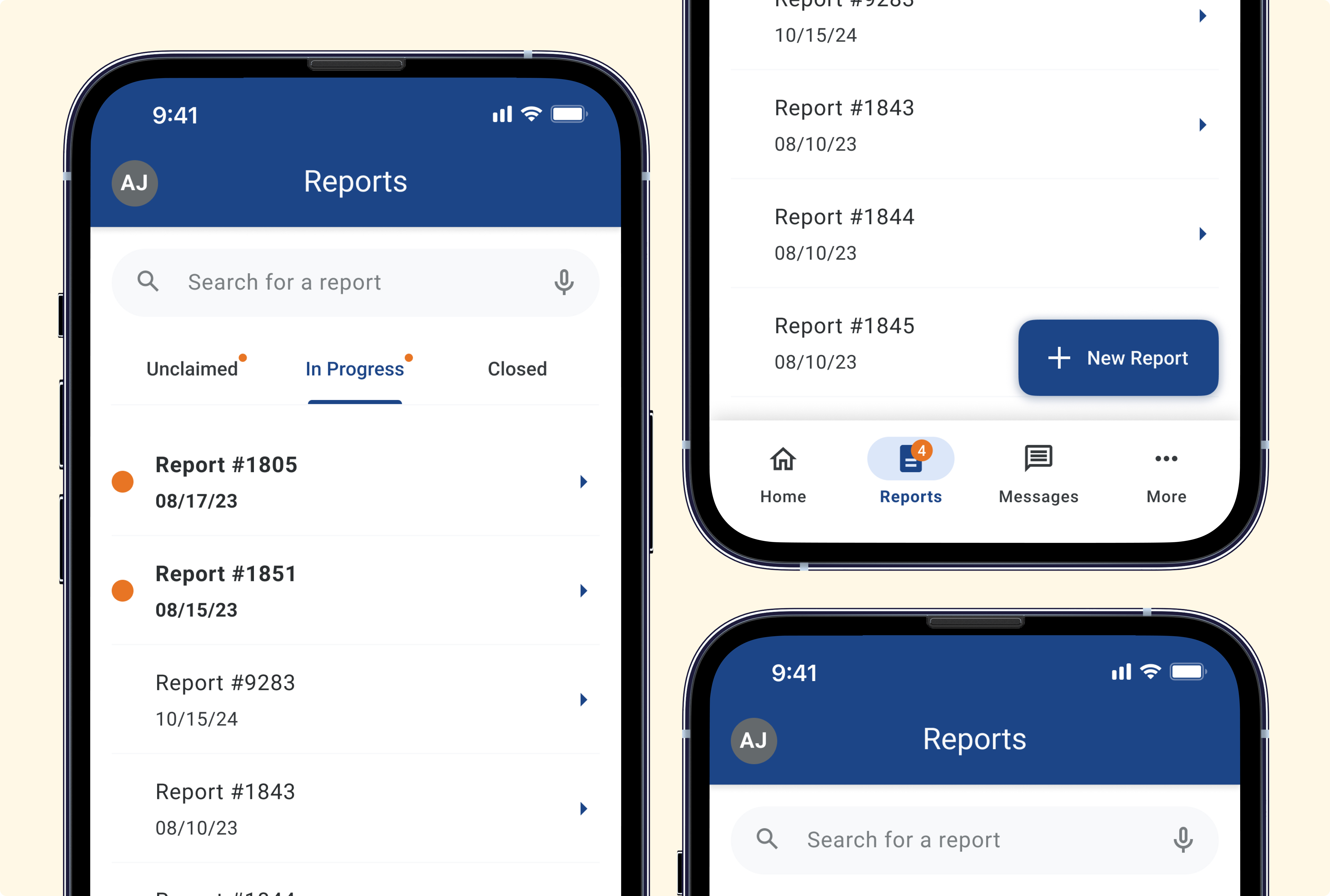
Search consumed valuable screen space
The search bar occupied a large portion of the mobile screen, limiting visibility of reports.